Principles for organising CSS code
As we’re edging ever-closer to making a start on our project, it’s important to think about how we are going to organise our CSS code. There are a few options available to us:
- Slap all of the CSS into one big file
- Go all-in on a framework like Bootstrap or Tailwind and inherit their principles
- Choose a methodology and use that to inform our CSS organisation
If we were building a quick prototype or a one-off side project, I would personally choose option one, all day. Prototypes and one-off side projects are supposed to be quick and importantly, fun, so simplifying things to a single HTML and CSS file, is a good idea to achieve that.
We’re not working on a project like that though. Sure, it’s a one page website for now but this website is going to expand in the future. With that in mind, we have option two and option three to consider. Let’s break them down in more detail.
Option two: Go all-in on a framework like Bootstrap or Tailwind and inherit their principles
The benefit of this approach — in theory — is that lots of battle tested CSS is already written for you. This is especially true if you select a framework like Bootstrap or Bulma. The problem is, that benefit can also be damaging unless your UI is extremely similar to what the framework gives you out of the box. If not, you’re going to be applying lots of customisations, which could quickly turn into technical debt.
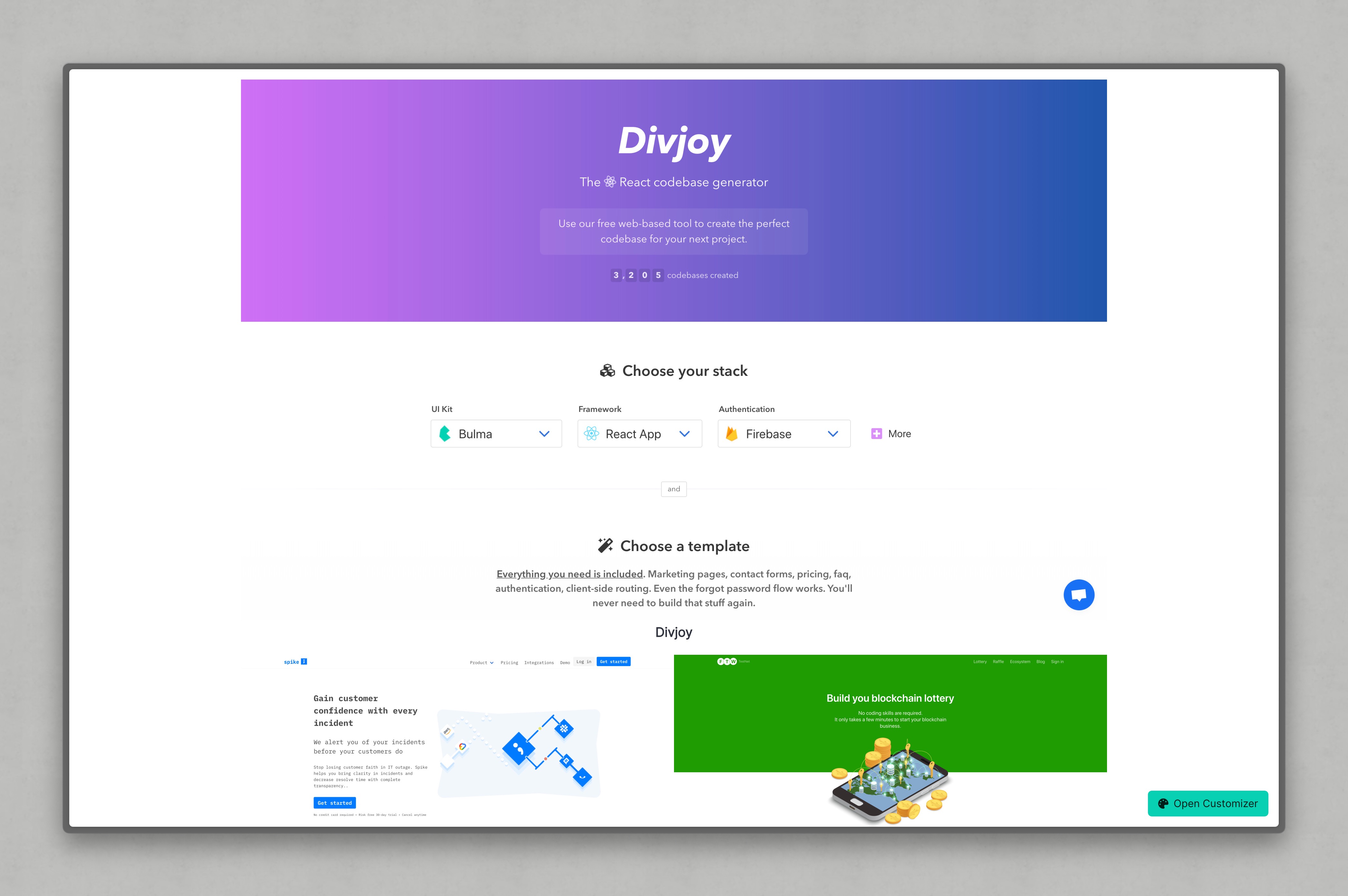
If you scroll through Bulma’s showcase of websites, you’ll probably notice that they all look pretty… similar.
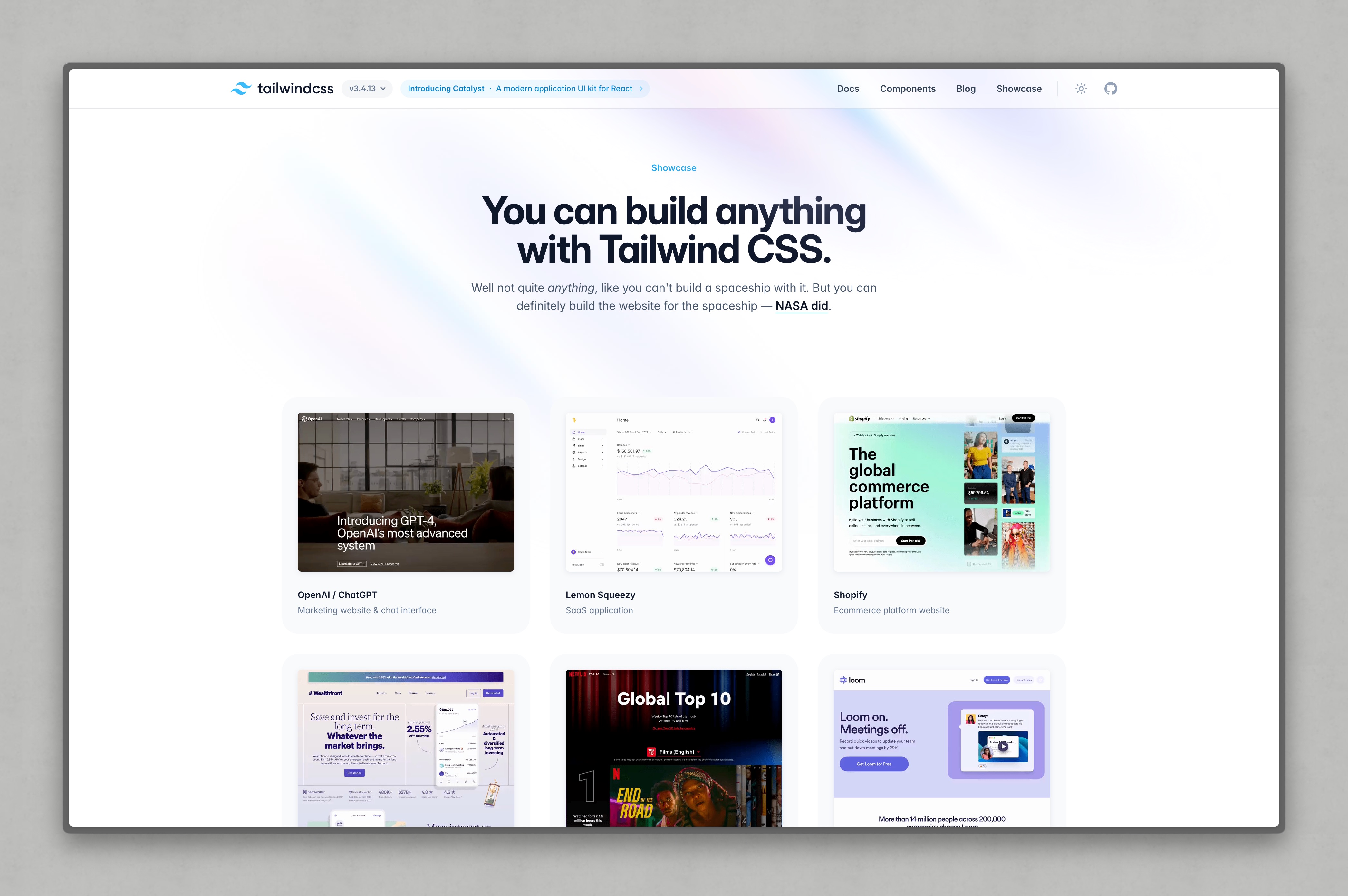
I couldn’t find a specific showcase of Bootstrap stuff, but let’s look at Tailwind’s showcase too. Again, aside from the font choices, a lot of the sites are very similar.
We joke in the studio that framework-built sites have a certain smell to them, and the above is what we’re referencing. When you’ve seen enough of these codebases, which unfortunately I have (these codebases are often the starting point to the CSS consultancy work I’ve done historically) — it becomes second nature to detect a framework is in place. Very often, that framework was phased out in favour of a methodology approach by the end of the project.
I have also seen framework builds that are really fantastic, with teams maintaining them who have impressive levels of knowledge on that framework. In that instance, a framework can be a net-good, but a risk with that is your talent pool for hiring, might be shallow.
A problem we might face is, our website design looking nothing like what the framework offers out of the box, so we’re likely going to have to spend a lot of time undoing what has already been done. Time is spent wrestling with configs and fighting overly-specific CSS in this case, which is not an ideal position to be in.
The thing with frameworks was that they were absolute gold when we were fighting the horrors of early responsive design and Internet Explorer. They solved a lot of the weird little bugs for free. The browser landscape couldn’t be any different now though, because all browsers — even Safari — are great at rendering CSS in a predictable, sensible fashion.
My advice when measuring a framework’s suitability for a project is to be pragmatic — not dogmatic — as a starting point. Your personal opinion might be “Tailwind is by far the best way to build websites”, but are you the only team member who has worked with Tailwind before? Do you have junior developers with low code comprehension skills that would get confused by the codebase? Are you going to have to hack the core framework to pieces (which I did in the case of Tailwind, and would not recommend)?
If the answers to the questions above, start making the framework look like a hindrance rather than a help, start trusting your gut because at the start of a project, making key decisions can have a lasting negative impact. It all goes back to going slow to move fast. If your theory is that the framework is going to save time, prove it with prototypes, because in the quest to prove that theory, you might find you were wrong. It’s better to find that out early, accept you were wrong (this happens to the best of us) and go back to the drawing board.
Choose a methodology and use that to inform our CSS organisation
I think for those that have followed my writing will know exactly what’s coming, because I created a methodology called CUBE CSS back in 2020. Let me explain the pathway to that.
I was a huge advocate for BEM — another methodology which is Block, Element and Modifier — for a lot of years. The main reason for my advocacy was, I was not very good at dealing with the cascade and specificity. BEM generally gives you very flat, low-specificity selectors, so it made managing large codebases a breeze. The code looks like this:
- Code language
- css
/* Block */
.my-component {
  background: black;
}

/* Element */
.my-component__element {
  font-weight: bold;
}

/* Modifier */
.my-component--light {
  background: white;
}
Element selectors contain the Block’s selector, a double underscore (__) and the element’s name. This makes code simple to understand in a number of ways. Firstly, it’s very clear what the relationships are, and secondly, looking at HTML, it’s very straightforward to be able to see what classes are on HTML elements and determine which CSS code file needs to be modified.
- Code language
- html
<div class="my-component">
  <p class="my-component__my-element"></p>
</div>
There’s a weakness to BEM that is not often talked about, and that weakness is modifiers. Modifiers are designed to create variations of your Blocks, or even Elements, and you author them by suffixing your selector with a double dash (--) and the variant’s name. With the above example, .my-component--light gives us a light variant of the component.
The downfall to this is that modifiers are CSS class-based, and you can add as many CSS classes — including modifiers — to your HTML elements, meaning you can’t guarantee which modifier will win. It’s not an ideal situation, because I personally treat modifiers as state changes. JavaScript usually determines state changes and JavaScript is very flaky and unpredictable. The following is expected behaviour when using BEM Modifiers:
- Code language
- html
<div class="my-component my-component--light my-component--success my-component--error">
  <p class="my-component__my-element"></p>
</div>
CUBE CSS is very similar to BEM — think of it as an iteration of BEM, rather than a completely different methodology. The main differences are first, we write a lot more global CSS than you do with BEM, but most importantly in the context of this lesson, Modifiers — known as Exceptions in CUBE — are finite because we use data attributes in markup.
- Code language
- html
<div class="my-component" data-state="error">
  <p class="my-component__my-element"></p>
</div>
- Code language
- css
.my-component {
  background: black;
  color: white;
}

.my-component[data-state="error"] {
  background: red;
  color: black;
}

.my-component[data-state="success"] {
  background: green;
}
As I hope you can see, the organisation of the component — a Block in CUBE — is really clear. In CUBE we can still use the same syntax for elements as BEM — a double underscore (__) — if we want. There’s no formal syntax for Blocks and the double underscore makes CSS so much simpler to author and read, in my opinion.
The point I’m trying to make about methodologies, is that you need to identify their weaknesses in the context of your project in the same way you need to identify weaknesses in frameworks. There is no such thing as a silver bullet in CSS. It’s about finding a system — or a combination of systems — that enable you and your team to author and maintain CSS in the most effective way possible.
If you dive head-first into an approach because it’s your personal preference, it’s almost certainly not going to end well, unless it’s only you working on the project. How do I know that? Well, like I said earlier on in this lesson, a lot of the messes I have helped organisations to clean up (so often), were rooted back to the personal preferences of individuals in the early stages of projects.
We’re only using CUBE CSS in the project because it’s what I know inside out, so I can more effectively teach you CSS. If this were a team project, CUBE CSS would go through the same levels of extreme scrutiny in the context of the team I was working in as anything else.
We’re going for a bit of both in our project
We’ll get into the weeds of our codebase before we start building, but this seems like a good time to mention that yes, we’re using CUBE CSS to build this project, but the U in CUBE — Utility — will be mostly powered by Tailwind CSS.
Tailwind is fantastic at generating single purpose utility classes on demand, which means the CSS is only generated if Tailwind can spot one of its utilities in your markup.
- Code language
- html
<div class="my-component bg-dark"></div>
The bg-dark class looks like this:
- Code language
- css
.bg-dark {
  background: black;
}
The overall CSS bundle only features these single purpose classes if they are found in the codebase, so as long as we use them sparingly, things won’t get out of hand. I’ve never personally seen the benefit of Atomic Style Sheets (ASS), which is when you don’t author CSS, but instead litter the HTML elements with single purpose utility classes. Maintaining those sort of codebases — in my experience — is often fraught with developers too timid to make changes, and worse, junior level developers literally being terrified of the codebase. That’s not acceptable for me.
On the other hand, re-working a framework like Tailwind to work for you, means you can apply design tokens rather efficiently in one-off edge cases. Instances where a couple of design tokens are needed to apply a background and colour to a region of content, is a really useful use-case of utilities also. You’ll see the benefits of that as we compose the home page later on in the course.
Again, it’s all about being pragmatic and thoughtful when authoring CSS. Speaking of being thoughtful, let’s move on to progressive enhancement to wrap up the principles module.