Fluid typography and space
Taking what we’ve learned from the last lesson — specifically the point that you truly have no idea what viewport a user is viewing your website with — it makes sense to, you know, get a bit fluid with how you build things.
Take this demo for example, the text is sized with media queries. Here’s a cut down version of the CSS:
- Code language
- css
.header__display-text {
  font-size: 2rem;
}

.header__display-text:first-of-type {
  font-size: 2.3rem;
}

@media (min-width: 768px) {
  .header__display-text {
    font-size: 6rem;
  }

  .header__display-text:first-of-type {
    font-size: 8rem;
  }
}

@media (min-width: 1100px) {
  .header__display-text {
    font-size: 8rem;
  }

  .header__display-text:first-of-type {
    font-size: 10rem;
  }
}
Pretty standard stuff, for sure, and using relative units for type is never really a bad thing. The problem is that, because the header__display-text items are really big, the jump of sizes is also big, leaving weird text sizes between break points.
Demo
How do we fix this? More breakpoints?
- Code language
- css
@media (min-width: 768px) {
  .header__display-text {
    font-size: 6rem;
  }

  .header__display-text:first-of-type {
    font-size: 8rem;
  }
}

@media (min-width: 865px) {
  .header__display-text {
    font-size: 7rem;
  }

  .header__display-text:first-of-type {
    font-size: 9rem;
  }
}

@media (min-width: 1100px) {
  .header__display-text {
    font-size: 8rem;
  }

  .header__display-text:first-of-type {
    font-size: 10rem;
  }
}
That’s just one extra breakpoint and as we learned in the last lesson: that can get way out of hand, really quickly. There’s got to be a better way though, right? The answer is fluid typography.
Setting up fluid typography
Let’s start with the demo so you can see the difference.
Demo
As you scale between viewport sizes, the text smoothly scales with it, always staying in a consistent ratio. It all works thanks to CSS clamp and a type scale. Let’s look at how clamp works first.

There’s three values you pass into the function: a minimum size, what I like to call the ideal size and finally, a maximum size. It’s really handy for fluid typography (and space), because you get those sensible rules for the browser with the minimum and maximum sizes. It also gives the browser space to work with the ideal size, which in our case is viewport-based units. This allows the text to scale with the viewport’s size.
That’s how the system works, so let’s now look at how to work with it, like a pro. Sure, you could create a number of fluid typography sizes, but you’ll probably find there’s something off about the overall rhythm of your page.
To combat this, we use a typographic scale. It’s a ratio-based system where each step up the scale is the current size multiplied by a ratio.

In the figure above, we’re using a 1.25 ratio — also known as a major third. For each step up the scale, the size is multiplied by 1.25 to get that next step’s value. The benefit of a typographic scale is like I say, rhythm and every size in the scale being a multiplication of the same ratio giving us exactly that.
The problem with traditional typographic scales however, is one ratio might be too big or too small when you’re dealing with multiple different sized viewports. Luckily for us, tools like Utopia exist.
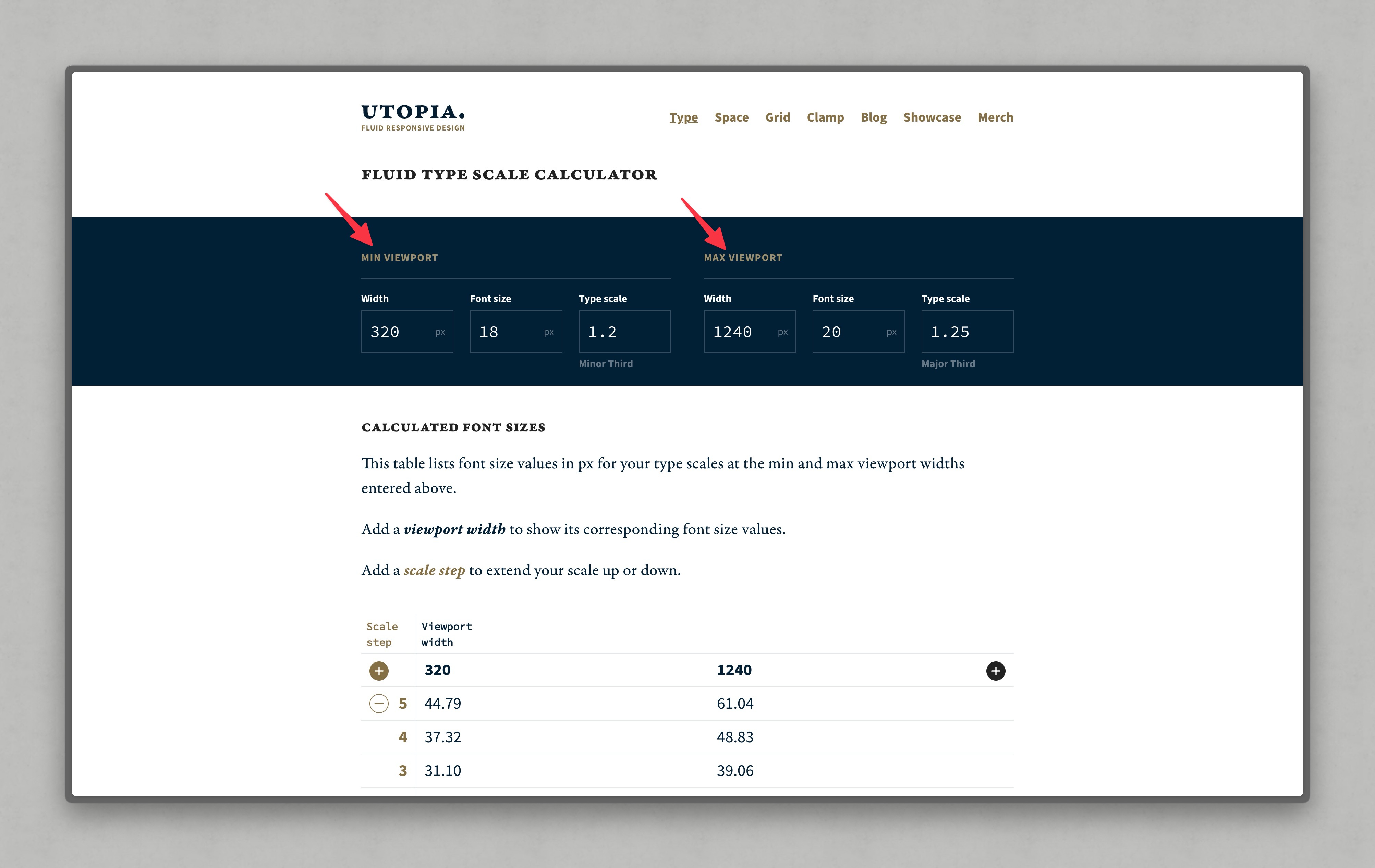
What Utopia does is, allow you to define multiple type scales, defaulted to two. Having multiple type scales allows you to have fluid typography that scales with the viewport, but also, each size step will remain in perfect harmony with the others.
The page that you’re reading this lesson on right now is using this setup. We’ve got quite a small ratio at the lowest type scale, servicing small viewports and a much larger ratio for the largest type scale, servicing large viewports.
The only time we even had to think about that was when we were setting up those type scales in Utopia. The tool then gives us a collection of CSS custom properties, which we then set and forget in our codebase.
- Code language
- css
:root {
  --step--1: clamp(0.83rem, calc(0.82rem + 0.08vw), 0.88rem);
  --step-0: clamp(1.00rem, calc(0.92rem + 0.39vw), 1.25rem);
  --step-1: clamp(1.20rem, calc(1.02rem + 0.88vw), 1.77rem);
  --step-2: clamp(1.44rem, calc(1.11rem + 1.65vw), 2.50rem);
  --step-3: clamp(1.73rem, calc(1.17rem + 2.80vw), 3.53rem);
  --step-4: clamp(2.07rem, calc(1.17rem + 4.54vw), 5.00rem);
  --step-5: clamp(2.49rem, calc(1.07rem + 7.11vw), 7.07rem);
  --step-6: clamp(2.99rem, calc(0.81rem + 10.88vw), 9.99rem);
}
These custom properties can then be used to size our text fluidly, like so:
- Code language
- css
body {
  font-size: var(--step-0);
}

h1 {
  font-size: var(--step-6);
}

h2 {
  font-size: var(--step-5);
}

h3 {
  font-size: var(--step-4);
}

h4 {
  font-size: var(--step-3);
}
Job done! This is the sort of simplification that allows our CSS to be much more maintainable in the long-term. Assigning fluid type at a global level means that the em and rem units will be in-ratio too, which is very handy indeed.
Fluid spacing
Technically we could space items using the same type scale we generated. Utopia does give us a spacing system, which I recommend using.
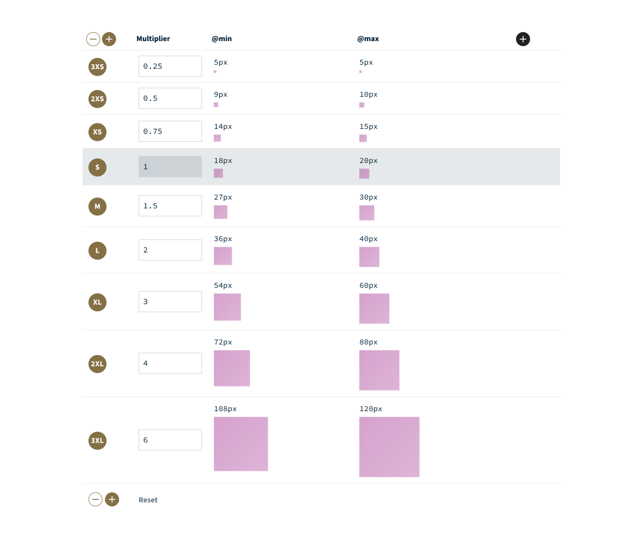
It works almost the same as the type scale generator, but instead of using multiple ratios, it allows you to set a custom ratio per step. The scaling is then based on the root font size of your type scale, allowing for larger space on larger viewports, and smaller space for smaller viewports. Delightful.
My favourite feature is space value pairs, which interpolate between two spacing steps. How they work is the @min value for the spacing step is the smallest value from the lower step, and the @max value is the largest value from the upper step. This creates a nice linear in-between size that will scale with the viewport nicely, especially if you want a considerably larger space on large viewports.

A great example of their usage is on the site we referenced in the last lesson: Be the browser’s mentor, not its micromanager.
Demo
The space pairs are used for each region of content. As you resize the viewport, you’ll see the vertical space reduces quite dramatically with the viewport.
What’s the benefit of that though? The benefit is, by letting the browser calculate what the space should be, based on some solid rules, the user will get the ideal experience. Without these sort of techniques — well, the user gets this instead:
Demo
Wrapping up
Fluid type and space is one of many techniques you’re going to learn in this course to make authoring CSS easier for you. The easier it is to author and maintain, the better it will scale, and most importantly, there will be less technical debt to manage too. This frees you up to focus on producing a better user experience, rather than chasing down weird CSS issues.
Next up, we’re sticking with fluidity and getting into flexible layout compositions.