Flexible layout compositions
I’ve mentioned previously in the course, that I did a lot of CSS consultancy for various sized organisations — from huge multinational corporations to smaller startups. What do you think the most common downfall in CSS codebases were across nearly all of these organisations? Framework choices? Sass? Less? CSS-in-JS? No, it’s layout and spacing.
The most common pitfall with layout and spacing was that front-end developers were applying CSS directly to components like this:
- Code language
- css
.card {
  margin: 2rem;
  width: 20rem;
}
The problem with that is, regardless of the layout you’re using, .card will always have a 2rem margin value and a 20rem width value. If .card happens to find itself in a flexbox or grid layout, margin collapse will also be ignored, compounding the issue. Applying a 20rem width also removes the possibility of a layout being able to effectively place our components too.
You might be thinking, “huh? It’s only a bit of margin and width”, which is fair, but also, what do you think happens to combat this earlier decision to apply spacing directly to a component?
- Code language
- css
.my-layout .card {
  margin: 1em;
  width: 15rem;
}

.my-page .card {
  margin: 0;
  width: 100%;
}

.my-component + .card {
  margin-top: 0;
  width: unset;
}
Smelly code is what happens! On the surface, there’s nothing offensive or damaging about the above CSS — it’s fine. We’re not in the business of writing fine CSS though, friends. We’re learning how to write excellent, scalable CSS. This is only one component applying spacing and width to itself too: try multiplying that by a minimum of 10, but likely 20+. It’s suddenly a real problem now.
Layout compositions are designed to simplify layout and harmony across the whole project. We build components to be sized and spaced by an outer, skeletal layout, which you guessed it, gives the browser hints and rules which lets it do the work for us.
I feel so strongly about this, 5 years ago, I co-authored Every Layout with Heydon Pickering because we were both obsessing over this concept of skeletal, macro-level layouts because of the CSS consultancy work we were doing at the time.
We’re going to use some of those layouts in this project, but let me explain a couple of them from our base files, to help you understand how they work:
- A flow composition that provides consistent vertical spacing between elements
- A responsive grid that is highly configurable
Flow composition
Let’s first look at the composition’s code.
- Code language
- css
.flow > * + * {
  margin-block-start: var(--flow-space, 1em);
}
The idea here is that vertical spacing should only ever be added to sibling elements. The selector in plain English is: “select direct children of the .flow class and then select those children’s siblings”.

The --flow-space custom property allows this composition to be customisable by more specific contexts, but by default — thanks to the fallback argument of the var function — 1em of margin is added to the top of each sibling element. This produces nice, natural flow.
See the Pen CSS Flow Utility: Basic implementation by piccalilli (@piccalilli) on CodePen.
Let’s say a component wanted to specify flow space:
- Code language
- css
.my-component {
	--flow-space: 2em;
}
Any elements with a .flow class’ direct children will now have 2em of space applied to them because the --flow-space has now been defined. This gives you infinite configurability options.
See the Pen CSS Flow Utility: Tweaked Basic implementation by piccalilli (@piccalilli) on CodePen.
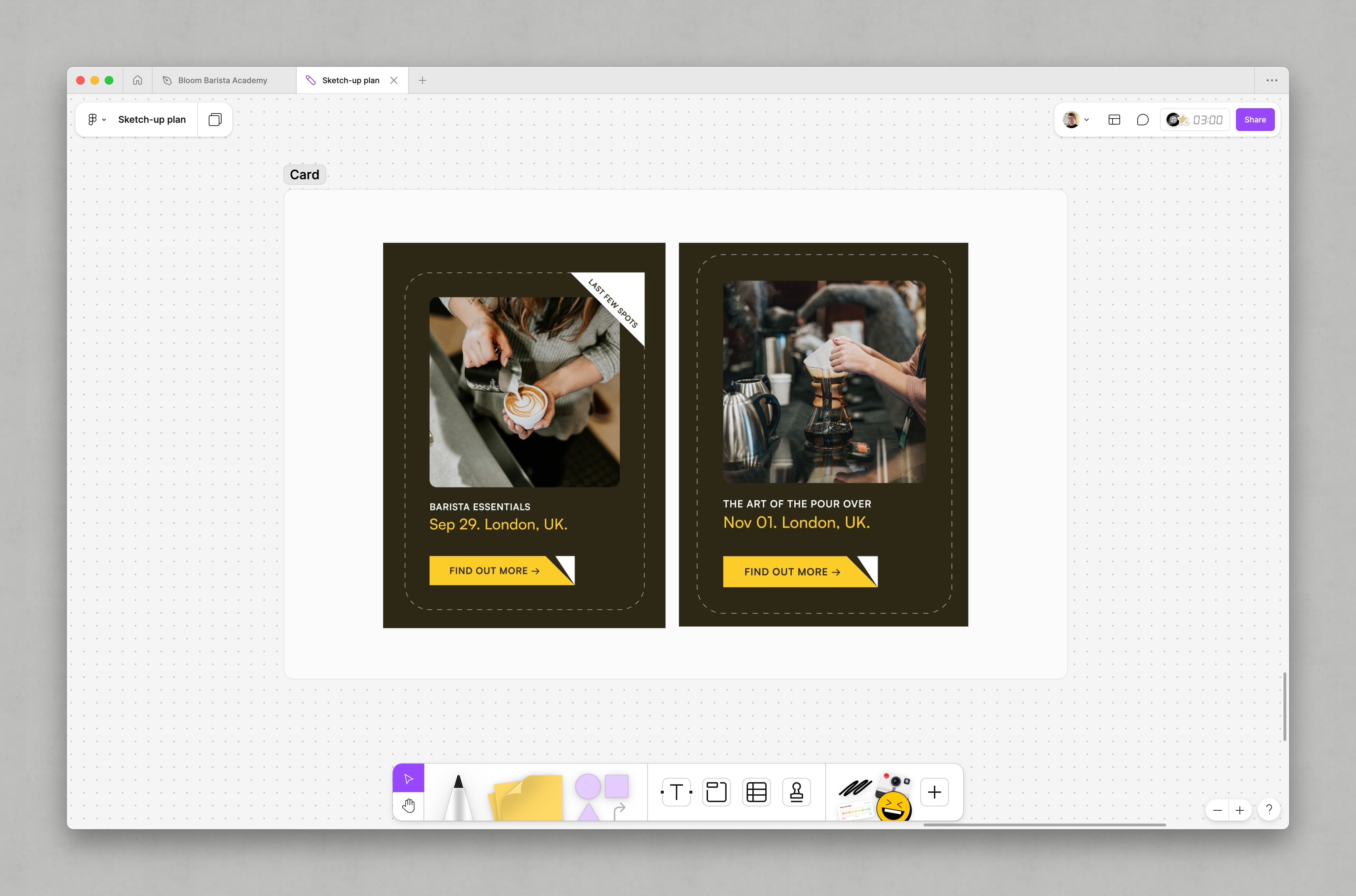
In our upcoming build, flow is going to be used everywhere. A good example though, is the spacing between content items in the card component.
Grid composition
This composition follows the same principles as the flow composition: as much as possible is configured with custom properties, which in turn, have sensible fallbacks.
- Code language
- css
.grid {
  display: grid;
  grid-template-columns: repeat(
    var(--grid-placement, auto-fill),
    minmax(var(--grid-min-item-size, 16rem), 1fr)
  );
  gap: var(--gutter, var(--space-s-l));
}
The default behaviour of this composition is to create a grid that sizes columns with the auto-fill keyword. This creates as many columns as it can, sized by minmax. If we were to use auto-fit instead, it would allow the columns to expand, rather than trying to pack as many columns into a row as it can.
Demo
The most important part of this layout though, is that it is highly responsive. Rather than specifying column sizes in media queries or container queries, we are letting the browser work for us by setting some sensible rules for it to follow.
If you want more granular control, there’s plenty of configuration options to lean into. For example, to create a three column grid — where the right space is available — we can either, define custom properties in a component, or using the CUBE CSS methodology — which we’re covering in the next lesson — we can create a handy exception like so:
- Code language
- css
.grid[data-layout='thirds'] {
  --grid-placement: auto-fit;
  --grid-min-item-size: clamp(16rem, 33%, 28rem);
}
Demo
Pretty handy, right? Let me explain the configuration we’ve applied. First of all, this is how we apply the exception to our grid layout’s HTML:
- Code language
- html
<div class="grid" data-layout="thirds">
  <!-- items -->
</div>
By setting --grid-placement to auto-fit, we’re instructing the CSS grid system to try to size columns to fit space rather than the default behaviour — with auto-fill — of creating as many columns as it deems sensible.
When we set --grid-min-item-size to clamp(16rem, 33%, 20rem), what we’re saying is “as a minimum, the items should be 16rem but aim for 33% of your width. Don’t let that get any larger than 20rem though”.
With only those two properties set, we have a three column grid that automatically stacks into a single column stack when there is not enough space for a grid. Handy!
Not all layouts need to be compositions
One thing to always remember — and something I always have to remind clients and colleagues — is compositional layouts are designed to be simple. Sure, you can hook clever stuff on to them, like we did on the Piccalilli site and the post layout. But, if your layout needs require you to try to modify the flexible layout compositions with media queries for example, it’s time to get specific.
All the layout compositions don’t use media queries for a reason:
In Every Layout, we eschew width-based @media queries. They represent the hard coding of layout reconfigurations, and are not sensitive to the immediate available space actually afforded the element or component in question. Scaling the interface at a discrete breakpoint, as in the last example, is arbitrary.
What we’re saying there is, similar to what we covered in the previous lesson: browsers are much smarter than us and can accommodate the vast array of viewports out in the real world.
But again, to remind you, these layouts are also extremely simple. There will be times where you have a complex layout, like the masthead on our project:
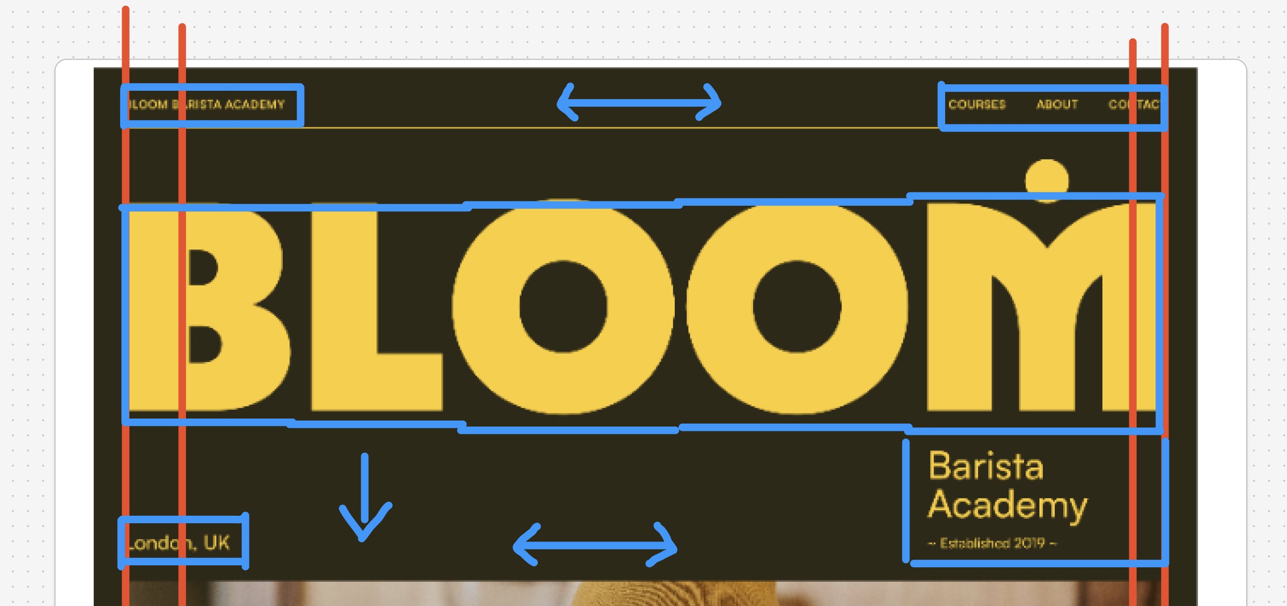
We’re getting into that one later, but spoiler alert, we don’t use a compositional layout because it’s way too complex.
A good rule of thumb is, to try to solve most of your layout needs with compositional layouts, because that means most of your UI is rock solid. This leaves you breathing room to write much more specific layouts when you almost certainly will need to.
Its hard to get your head around — I know — but trust me, if there are two things that will transform your front-end, it is fluid typography and space from the last lesson and compositional layout from this lesson. I’ll explain our decision making processes on both as we get into the more practical stuff.
Next up, let’s look at how we’re going to organise our code with a CSS methodology.