Redesigning Piccalilli: the build process
At this point, we’ve completed the design work and have also produced a backlog of production tasks, so I’m sorry to say, the build is actually quite boring to write about.

It’s boring because at this point, almost all eventualities should be accounted for, so the developers only have to concentrate on writing scalable, maintainable code.
HTML only build of the site
What’s the best way to write scalable, efficient and maintainable code? It’s not faffing around, arguing about frameworks, that’s for sure. It’s all about getting the baseline experience — the foundations — of the site as solid as possible and the best way to achieve that is concern ourselves, in terms of output, solely on HTML.
Sure, we’re running with React and JSX on this project. It’s because we know that Astro will not render a massive bundle of bloated client-side JavaScript by default. Working with React components means we can effectively and efficiently move platform if Astro doesn’t work out so good in the longer term, along with enabling working with Storybook easier. Regardless of the technology choices for components, we want to make sure the output HTML is in tip-top shape. A framework won’t write bad HTML, it’s people that fall short more often than not.
We add a very small amount of CSS to utilise the system font stack because raw HTML makes our eyes sad, but hopefully you can see, it’s super paired-back. It’s much easier to scan the structure of the page like this too.
We build the whole site as HTML, giving us an end deliverable of a HTML-only, fully functional webpage. There’s no client-JS interactivity at this point, but ultimately, we want the minimum viable experience to be our solid foundation.
We also use this phase of production to get the structure of the pattern library in place. In our case, this is using Storybook. Our focus for components now is less how they look and more what the structure of their output is and also the structure of the data that is passed between them.
- Code language
- tsx
export interface Topic {
  label: string;
  link: string;
}

export interface TopicsListProps {
  heading?: string;
  topics: Topic[];
}

const TopicsList: React.FC<TopicsListProps> = ({ heading = 'Topics', topics }) => {
  return (
    <nav aria-label="Topics">
      <h2>{heading}</h2>
      <ul>
        {topics.map((topic, index) => (
          <li key={index}>
            <a href={topic.link}>{topic.label}</a>
          </li>
        ))}
      </ul>
    </nav>
  );
};

export default TopicsList;
It’s really useful to be focused on a small number of things at any time. Separation of concerns really helps with that and with the HTML-only build in place, we can move on to CSS.
Integration of CSS
We built the front-end already with the prototypes, so in terms of applying the correct design tokens and overall look and feel, we’ve already solved that problem.
Our focus now with CSS is putting all of our effort on long term maintainability. We know how to build the front-end of the site, but we’re at this point, thinking about future iterations of the design and what’s coming up in the shorter term.
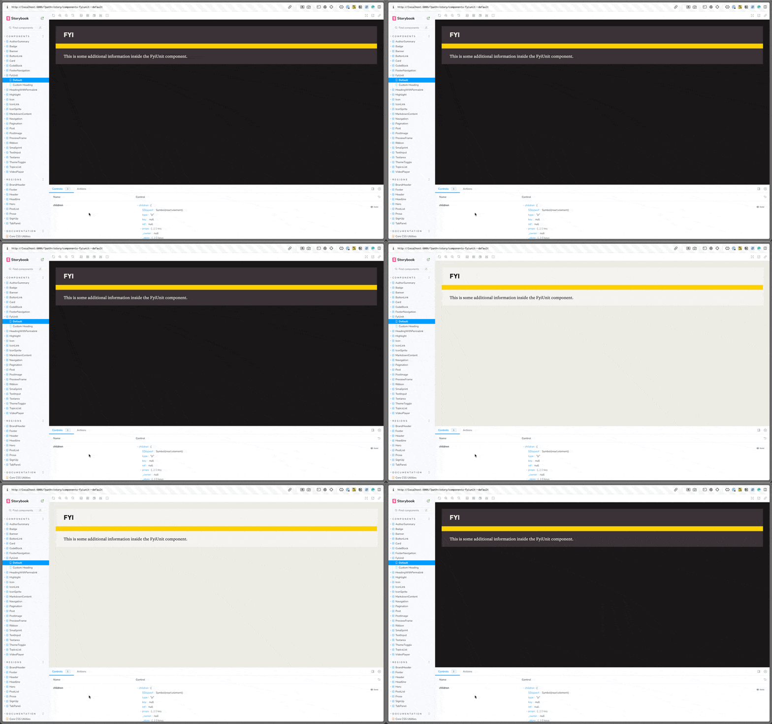
A good example of this is the theming system we’ve implemented, which you can read about here. We’re not, y’know, going to design loads of themes for the site that can be toggled, but instead, once the components are in place — structurally — the theme is what applies the look and feel. An immediate need for that theming system is dark mode.

With that in mind, all of the components look a bit like this:
- Code language
- css
.badge {
  display: var(--badge-display, inline-flex);
  border: var(--badge-border, var(--stroke));
  padding: var(--badge-padding, calc(var(--space-2xs) * 0.5) var(--space-2xs));
  font-size: var(--badge-font-size, var(--size-step--3));
  font-family: var(--badge-font-family, var(--font-display));
  color: var(--badge-color, var(--text-dark));
  text-decoration: var(--badge-default-decoration, none);
  text-transform: var(--badge-text-transform, uppercase);
}

.badge:is(a):hover {
  background-color: var(--badge-hover-bg, var(--color-dark));
  color: var(--badge-hover-color, var(--color-light));
  border-color: var(--badge-hover-border-color, var(--color-dark));
}
You might think that is overkill, but it allows two things. First, setting up a different colour scheme is as simple as this:
- Code language
- css
:root {
  --badge-color: var(--text-light);
  --badge-hover-bg: var(--color-light);
  --badge-hover-color: var(--color-dark);
  --badge-hover-border-color: var(--color-light);
}
Second, by making nearly everything configurable based on a solid HTML structure means that if we want to redesign or refresh the UI in the longer term, technically, we should be able to define a new theme configuration and be done with it. It makes future iteration prototypes much quicker too.
The most realistic use-case for this theming is that every course we publish will have a specifically branded landing page that doesn’t necessarily match the overarching Piccalilli look and feel. We can theme those landing pages with the theme system, including large layout differences quite easily. It also means there is scope for articles to have art direction in the long term, too.
Wrapping up
We’re building this thing to be as low effort as possible to maintain so we can focus all of our energy on producing excellent content instead. The way it’s coming together, I think we might have done just that.
I hope you’ve enjoyed this series on redesigning the Piccalilli site. I’ve certainly enjoyed writing it. The next thing you see about this stuff is the actual live site very soon. We can’t wait for you to see it.
If you like the way we at Set Studio have approached this stuff, get in touch. We’d love to hear how we can help.
Enjoyed this article? You can support us by leaving a tip via Open Collective


