Front-End challenge: Eyebrow heading dots
I’m going to do this thing a little differently and start with my solution and ask for folks to come up with a better solution.
The context is a little “eyebrow” heading, but the complexity is there are decorative dots each side. I’m close — with the help of magic numbers — but I want something extremely scalable and intrinsic, ideally.

When the content breaks on to two lines, I want those dots to sit right up to edges of the text with a nice gap to cushion that.
Starting with a pretty standard grid layout
My first idea was to allow the content to naturally wrap, only specifying the size of the decorative columns as 1fr each. It works great on large viewports, but on small viewports, those dots were pushed out to the edges.
- Code language
- css
.eyebrow {
  font-size: var(--size-step-0);
  font-weight: 500;
  text-transform: uppercase;
  text-align: center;
  text-wrap: balance;
  max-width: unset;
  font-feature-settings: "cpsp" on;
  display: grid;
  align-items: center;
  grid-template-columns: 1fr auto 1fr;
  gap: 0 var(--space-s);
}

.eyebrow span::before {
  content: "";
  display: block;
  aspect-ratio: 1;
  height: 0.7ex;
  background-color: currentColor;
  border-radius: 100%;
}

.eyebrow span:first-child::before {
  margin-inline-start: auto;
}
See the Pen Eyebrow: standard grid by piccalilli (@piccalilli) on CodePen.
As far as I can tell, using min-content, max-content and fit-content to size the content isn’t going to do the job because where space allows the text needs to flow nicely on a single line. But, fit-content with some control in place works ok.
- Code language
- css
.eyebrow {
  font-size: var(--size-step-0);
  font-weight: 500;
  text-transform: uppercase;
  text-align: center;
  text-wrap: balance;
  max-width: unset;
  font-feature-settings: "cpsp" on;
  display: grid;
  align-items: center;
  grid-template-columns: 1fr fit-content(30ch) 1fr;
  gap: 0 var(--space-s);
}

.eyebrow span::before {
  content: "";
  display: block;
  aspect-ratio: 1;
  height: 0.7ex;
  background-color: currentColor;
  border-radius: 100%;
}

.eyebrow span:first-child::before {
  margin-inline-start: auto;
}
See the Pen Eyebrow: fit content by piccalilli (@piccalilli) on CodePen.
Where I’ve ended
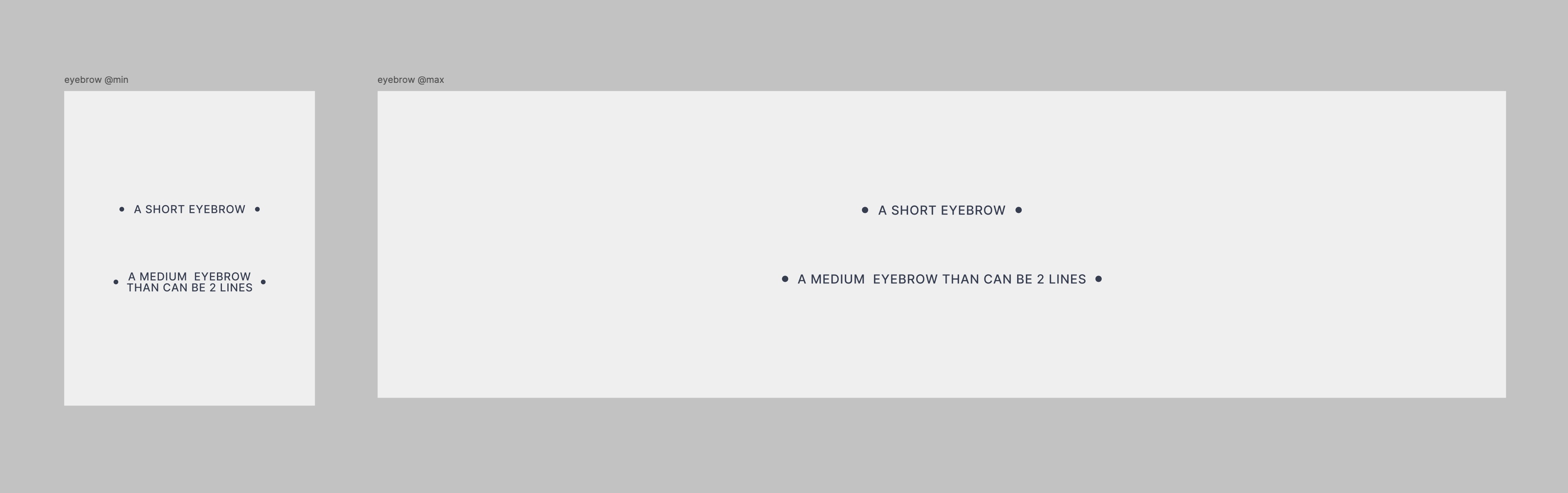
I’m using minmax to size the decorative columns based on either a viewport width or 1fr. This allows the decorative columns to nicely fill space where there is space to fill, but on small screens, push everything in enough to give the effect we’re after.
- Code language
- css
.eyebrow {
  font-size: var(--size-step-0);
  font-weight: 500;
  text-transform: uppercase;
  text-align: center;
  text-wrap: balance;
  max-width: unset;
  font-feature-settings: "cpsp" on;
  display: grid;
  align-items: center;
  grid-template-columns: minmax(13vi, 1fr) auto minmax(13vi, 1fr);
  gap: 0 var(--space-s);
}

.eyebrow span::before {
  content: "";
  display: block;
  aspect-ratio: 1;
  height: 0.7ex;
  background-color: currentColor;
  border-radius: 100%;
}

.eyebrow span:first-child::before {
  margin-inline-start: auto;
}
See the Pen Eyebrow: my approach by piccalilli (@piccalilli) on CodePen.
What I’d love to achieve
- No magic numbers
- No extra elements in the heading
I’m sure it’s possible to do the above and based on previous editions of Front-End Challenges Club, there’s some seriously smart people giving them a go.
Fancy your chances with this little challenge? Go ahead and fork this CodePen (or grab the code and do what you want) and let us know how you did it! You can catch me at the following locations too.
For the solution to this challenge, I’ll pick my favourite attempt, apply it in the actual context and show you all how it does, while hopefully breaking it down into something easy for you all to understand.
A closing note: it doesn’t have to use grid either. That’s just the route I chose 🙂
Enjoyed this article? You can support us by leaving a tip via Open Collective
Take your career to the next level by taking our premium courses and save 20%
Take your career to the next level by taking our premium courses and save 20%
Use the code NEXTLEVEL at checkout to get our courses for only £249 £199.20. By taking our courses, you’re supporting independent publishing, rooted in doing right for workers in design, development and leadership.

Piccalilli exists to help you produce the best work of your career
Piccalilli exists to help you produce the best work of your career
Founded by Andy Bell in 2018, and now also produced by the wider team at Set.Studio, Piccalilli is an independent publisher providing high quality premium courses, articles and a newsletter.