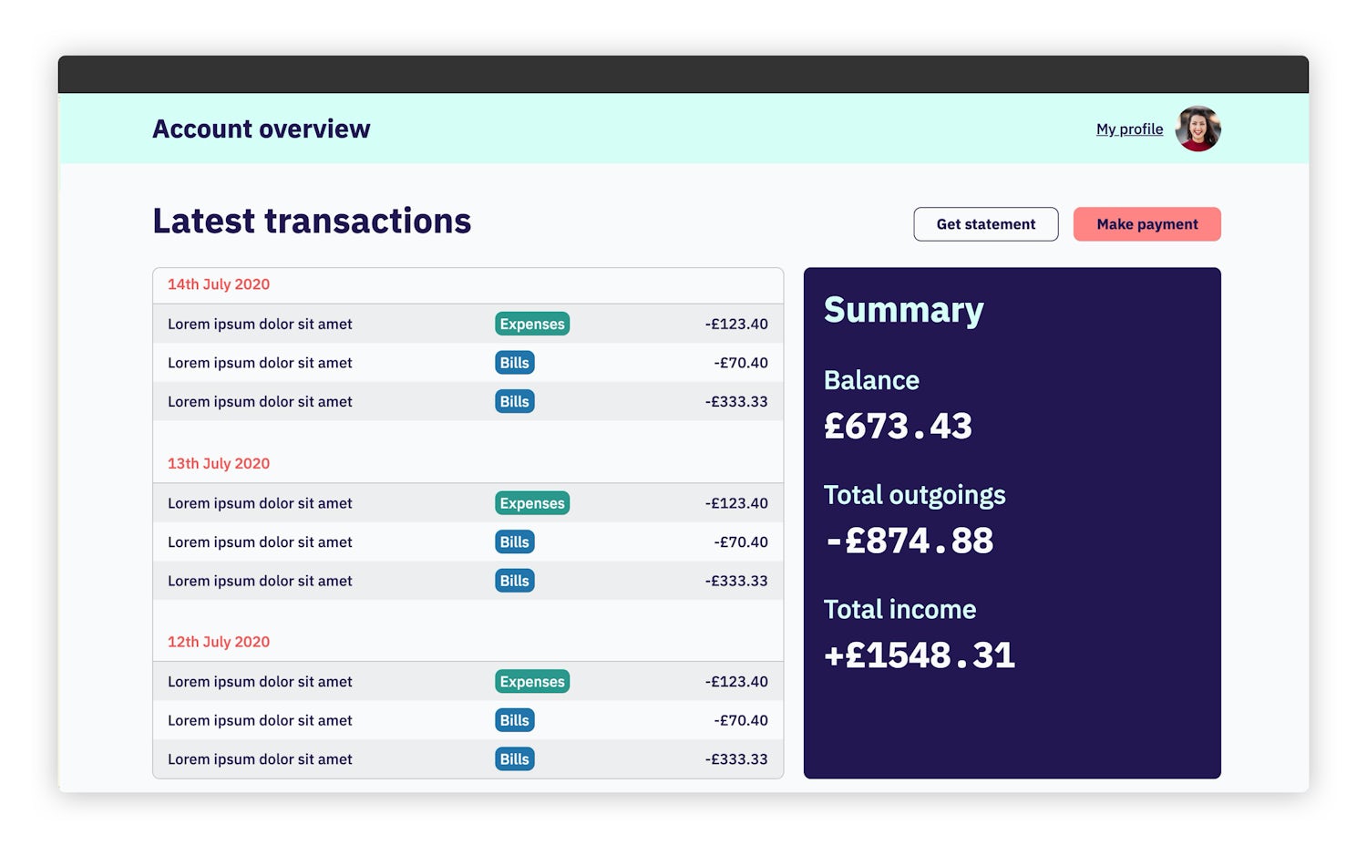
CUBE CSS allows us to build seemingly complex front-ends with relative ease and to demonstrate that, in this tutorial, we’re going to build a banking dashboard which covers the whole methodology.
See what you are buildingBefore we start, it’s recommended that you check out the CUBE CSS docs or read the introduction post to get a feel for what we are working.
Starter filespermalink
To focus this tutorial on the CSS only, we’re going to use a HTML boilerplate that I built earlier, with all of the necessary folders and assets, so the first thing you need to do is download those and set them up wherever you need to.
Download starter filesNow they are downloaded, your folder structure should look a bit like this:
- Code language
- diff
index.html
fonts
Images
scss
├── blocks
└── utilities
Setting up Sasspermalink
We’re going to use Sass for this tutorial along with a project I maintain called Gorko, which allows us to generate utility classes.
The first thing we’ll do is install Sass, so in your terminal, run the following:
- Code language
- bash
npm install sass
This installs canonical Sass, which is the version of Sass you should be using, if possible, because you get all of the latest features quickest. It’s also currently the only way to use the most modern CSS features within Sass.
You should have a package.json file in your starter files, so open that up and replace the "scripts" section with the following:
- Code language
- json
"scripts": {
  "start": "npx sass scss/global.scss css/global.css --watch",
  "build": "npx sass scss/global.scss css/global.css --style=compressed"
},
You should now be able to run npm start which will run Sass and then watch for any file changes.
Now that we have Sass installed, let’s install Gorko. In your terminal, run the following:
- Code language
- bash
npm install gorko
Let’s now add some config for Gorko. In your working folder, in the scss folder, create a new file called _config.scss and add the following to it:
- Code language
- scss
/**
 * BASE SIZE
 * All calculations are based on this. It’s recommended that
 * you keep it at 1rem because that is the root font size. You
 * can set it to whatever you like and whatever unit you like.
 */
$gorko-base-size: 1rem;

/**
 * SIZE SCALE
 * This is a Major Third scale that powers all the utilities that
 * it is relevant for (font-size, margin, padding). All items are
 * calcuated off the base size, so change that and cascade across
 * your whole project.
 */
$gorko-size-scale: (
  '300': $gorko-base-size * 0.8,
  '400': $gorko-base-size,
  '500': $gorko-base-size * 1.33,
  '600': $gorko-base-size * 1.77,
  '700': $gorko-base-size * 2.4
);

/**
 * COLORS
 * Colors are shared between backgrounds and text by default.
 * You can also use them to power borders, fills or shadows, for example.
 */
$gorko-colors: (
  'primary': #231651,
  'secondary': #ff8484,
  'secondary-shade': #ff5151,
  'tertiary': #2c988c,
  'tertiary-glare': #d6fff6,
  'quaternary': #2374ab,
  'light': #fafafa,
  'light-shade': #eeeeee,
  'grey': #c4c4c4
);

/**
 * CORE CONFIG
 * This powers everything from utility class generation to breakpoints
 * to enabling/disabling pre-built components/utilities.
 */
$gorko-config: (
  'bg': (
    'items': $gorko-colors,
    'output': 'standard',
    'property': 'background'
  ),
  'color': (
    'items': $gorko-colors,
    'output': 'standard',
    'property': 'color'
  ),
  'font': (
    'items': (
      'base': '"IBM Plex Sans", Helvetica, Arial, sans-serif',
      'mono': '"IBM Plex Mono", Courier New, Courier, monospace'
    ),
    'output': 'standard',
    'property': 'font-family'
  ),
  'gap-top': (
    'items': $gorko-size-scale,
    'output': 'standard',
    'property': 'margin-top'
  ),
  'pad-top': (
    'items': $gorko-size-scale,
    'output': 'standard',
    'property': 'padding-top'
  ),
  'text': (
    'items': $gorko-size-scale,
    'output': 'responsive',
    'property': 'font-size'
  ),
  'weight': (
    'items': (
      'medium': '500',
      'bold': '700'
    ),
    'output': 'standard',
    'property': 'font-weight'
  ),
  'breakpoints': (
    'md': '(min-width: 48em)'
  )
);
I won’t go into too much detail with this because the Gorko documentation does that already, but essentially, what we have here is some colour, fonts and a size scale (perfect fourth) which then informs various low-level utilities. This is the U in CUBE that we are working with.
Now that we have the config, let’s add a reset. We’re going to use this modern reset here. In your working folder, in the scss folder, create a new file called _reset.scss and add the following to it:
- Code language
- scss
// Modern CSS reset: https://github.com/hankchizljaw/modern-css-reset

/* Box sizing rules */
*,
*::before,
*::after {
  box-sizing: border-box;
}

/* Remove default padding */
ul[class],
ol[class] {
  padding: 0;
}

/* Remove default margin */
body,
h1,
h2,
h3,
h4,
p,
ul[class],
ol[class],
figure,
blockquote,
dl,
dd {
  margin: 0;
}

/* Set core root defaults */
html {
  scroll-behavior: smooth;
}

/* Set core body defaults */
body {
  min-height: 100vh;
  text-rendering: optimizeSpeed;
  line-height: 1.5;
}

/* Remove list styles on ul, ol elements with a class attribute */
ul[class],
ol[class] {
  list-style: none;
}

/* A elements that don't have a class get default styles */
a:not([class]) {
  text-decoration-skip-ink: auto;
}

/* Make images easier to work with */
img,
picture {
  max-width: 100%;
  display: block;
}

/* Natural flow and rhythm in articles by default */
article > * + * {
  margin-top: 1em;
}

/* Inherit fonts for inputs and buttons */
input,
button,
textarea,
select {
  font: inherit;
}

/* Blur images when they have no alt attribute */
img:not([alt]) {
  filter: blur(10px);
}

/* Remove all animations and transitions for people that prefer not to see them */
@media (prefers-reduced-motion: reduce) {
  * {
    animation-duration: 0.01ms !important;
    animation-iteration-count: 1 !important;
    transition-duration: 0.01ms !important;
    scroll-behavior: auto !important;
  }
}
We’ve got our base setup now, so let’s start building out our global styles. In your working folder, in the scss folder, create a new file called global.scss and add the following to it:
- Code language
- scss
// First up: config
@import 'config';

// Next: pull in gorko for design tokens
@import '../node_modules/gorko/gorko.scss';

// Pull in modern reset
@import 'reset';
We’re pulling in our config, which informs Gorko. Then, we pull in our reset. In your output (css/global.css), you should now see some reset styles and utility classes.
Global stylespermalink
The base of CUBE CSS is global styles, so let’s add some of those now. Open up scss/global.scss and add the following to it:
- Code language
- scss
// Global CSS starts
body {
  line-height: 1.5;
  overflow-x: hidden;
  padding-bottom: get-size('600');

  @include apply-utility('weight', 'medium');
}

h1,
h2,
h3 {
  line-height: 1.2;
}

h1 {
  font-size: get-size('700');
}

h2,
h3 {
  font-size: get-size('600');
}

a {
  color: currentColor;
}

table {
  border-collapse: collapse;
}

th {
  text-align: left;
}

:focus {
  outline: 2px dotted;
  outline-offset: 0.25rem;
}
The design of this UI is pretty simple, so there’s not much to do here, but as you can see, our focus is element selectors, where key elements, such as headings, get some rules set. We also cover global focus styles to make sure each focusable element gets a consistent treatment.
Utilities and tokenspermalink
With the globals in place, let’s start adding some core utilities and design tokens to our HTML. Most of the tokens are already implemented in the HTML because this would be a hell of a boring tutorial if we added them all manually, but to give you a feel for how things work, we’ll add some key ones now.
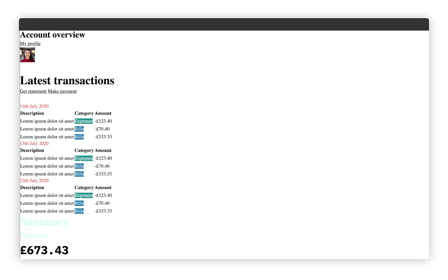
First of all, run your site locally and take a look. It should look a bit like this:

As you can see, with global styles and most of the tokens implemented, it doesn’t look half-bad at all. This is the magic of CUBE CSS: we can do a lot with very little.
Let’s add some more tokens. Open up index.html and on line 11 there should be the opening <body> tag. Replace it with the following:
- Code language
- html
<body class="bg-light color-primary font-base"></body>
That’s globally setting some colour tokens and the base font as the main font. Let’s continue this process by moving to line 12 with the <header role="banner"> element. Replace it with the following:
- Code language
- html
<header role="banner" class="[ site-head ] [ bg-tertiary-glare ]"></header>
We’ve added a site-head block, which we will come back to soon, but the main thing here is we’ve set its background colour with a utility.
Lastly, skip down to line 116. You should see the following: <section class="[ summary ] [ flow radius ]">. Replace that with the following:
- Code language
- html
<section class="[ summary ] [ flow radius ] [ bg-primary color-light ]"></section>
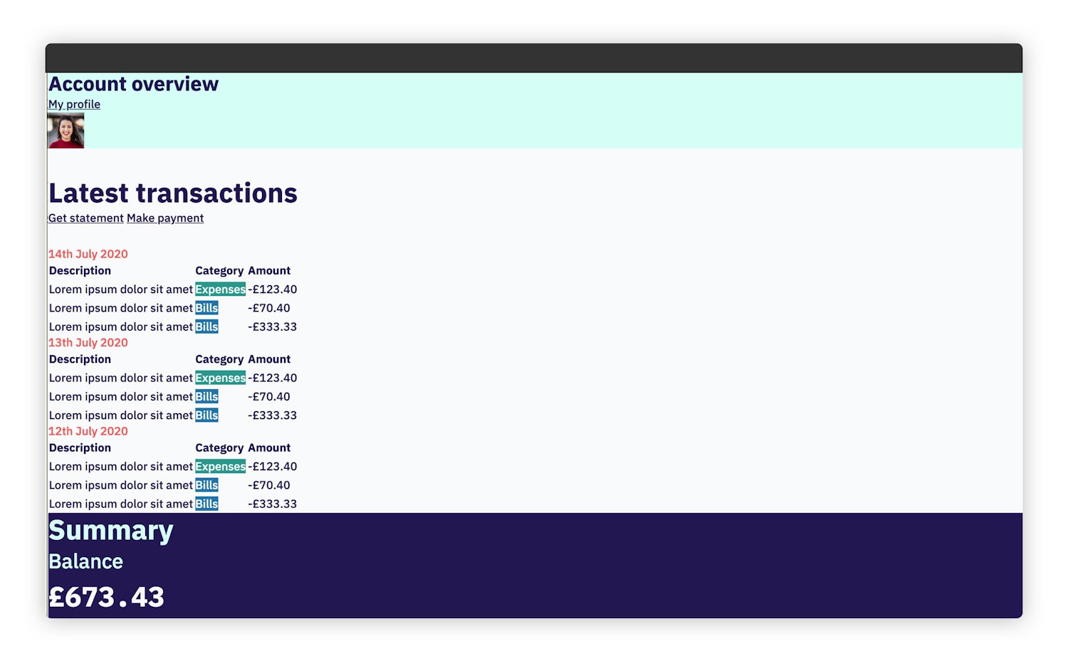
Now, when you reload your local version of this page, it should look like this:

Pretty cool, right? So much of the design implementation is already done. Now we’ve got to do the other parts of CUBE: composition, blocks and exceptions.
Composition stylespermalink
Right, we’ve done quite a lot already. Now it’s time to look at the bigger picture with composition styles. We’ll start with some high-level layouts.
Wrapper
The wrapper gives us a consistent max-width container with a bit of gutter. This is destined to be a utility because remember: a utility does one job and does it well.
Create a new file called scss/utilities/_wrapper.scss and add the following to it:
- Code language
- scss
.wrapper {
  max-width: 75rem;
  margin-left: auto;
  margin-right: auto;
  padding: 0 get-size('500');
}
The get-size function comes from Gorko and allows us to grab a size ratio value based on the key.
Flow
Next up is flow. This is a super tiny utility that adds margin to child sibling elements, using a lobotomised owl selector. This means that we get tonnes of flexibility, because any element will be affected (unless they are display: inline) and we don’t have to add daft CSS that targets last children to remove spacing.
Create a new file called scss/utilities/_flow.scss and add the following to it:
- Code language
- scss
.flow > * + * {
  margin-top: var(--flow-space, 1rem);
}
We first look for a --flow-space Custom Property and if that’s defined, it gets used. By default, using a fallback, we tell each child element to space itself 1rem from its sibling. The great thing about using a Custom Property is that we can control spacing in context without touching this utility again. Those Custom Properties are affected by the cascade too.
We use a more comprehensive version of this utility in Every Layout, where it’s called The Stack.
Splitter
This utility gives us our main responsive layout, which is two elements pushed away from each other at larger viewports.
Create a new file called scss/utilities/_splitter.scss and add the following to it:
- Code language
- scss
.splitter {
  > :last-child {
    margin-top: get-size('500');
  }

  @include media-query('md') {
    display: flex;

    > * {
      flex-grow: 1;
    }

    > :last-child {
      margin-top: 0;
      margin-left: get-size('500');
      min-width: 22rem;
    }
  }
}
Being called splitter, this utility assumes it is dealing with two elements, so it works that way. This is shown right at the start of the utility when the last child has margin added to it.
The rest of this utility adds flex at larger viewports, then flips the spacing.
Visually hidden
Create a new file called scss/utilities/_visually-hidden.scss and add the following to it:
- Code language
- scss
.visually-hidden {
  border: 0;
  clip: rect(0 0 0 0);
  height: auto;
  margin: 0;
  overflow: hidden;
  padding: 0;
  position: absolute;
  width: 1px;
  white-space: nowrap;
}
This utility does what it says on the tin: it visually hides stuff. Using this utility instead of using display: none means that screen reader users can still access the content. In our project, this mainly affects the table headers.
Radius
Last up in these utilities is radius. This one isn’t technically a compositional rule, but while we’re in here, we might as well add it.
Create a new file called scss/utilities/_radius.scss and add the following to it:
- Code language
- scss
.radius {
  border-radius: 0.5rem;
}
If there was ever a single-purpose utility, it would be this one!
Wiring up the utilities and composition stylespermalink
Open up scss/global.scss and add the following:
- Code language
- scss
// Utilities
@import 'utilities/flow';
@import 'utilities/radius';
@import 'utilities/splitter';
@import 'utilities/wrapper';
@import 'utilities/visually-hidden';
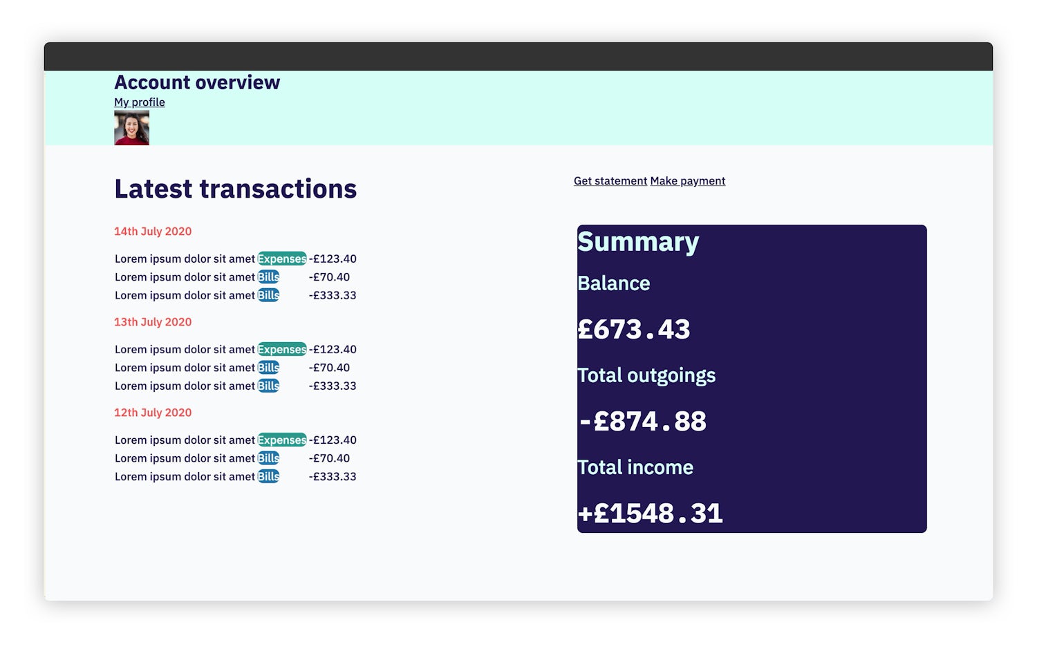
Here, we are importing all of the CSS we have just written. If you reload your local version now, it should look like this:

Adding our blockspermalink
Now we’ve handled global styles, design tokens, single purpose utilities and composition styles, we naturally move on to blocks. We’ll also get into exceptions at this point too.
Site header
This is the main header of the site, but it’s a super tiny block. Create a new file called scss/blocks/_site-head.scss and add the following to it:
- Code language
- scss
.site-head {
  padding: 0.8rem 0;

  &__inner {
    display: flex;
    flex-wrap: wrap;
    align-items: center;
    justify-content: space-between;
  }

  // Right margin prevents any collisions with the title
  h1 {
    margin: 0.5rem 1rem 0.5rem 0;
  }
}
The main theme of this block is to create an auto-wrapping flex layout. We’ve only got two elements: a heading and a user block—which we’ll build next—that should never collide with each other. We guarantee this by building a force-field around our <h1> with margin.
User
While we’re in the site head, let’s build the user block. Create a new file called scss/blocks/_user.scss and add the following to it:
- Code language
- scss
.user {
  display: inline-grid;
  align-items: center;
  grid-template-columns: max-content 50px;
  grid-gap: get-size('300');

  img {
    border-radius: 100%;
  }
}
Firstly, we use inline-grid because we want this block to only be as big as the content inside it. For that same reason, we use max-content in the grid-template-columns declaration. Lastly, we again, directly target the HTML <img> element and apply our 100% radius.
Key header
This is the element that introduces our transactions and summary. It provides a label for that data and also some key actions. It’s already got the splitter on it, so in true CUBE CSS fashion, we are using this block to create more contextual specificity.
Create a new file called scss/blocks/_key-header.scss and add the following to it:
- Code language
- scss
.key-header {
  align-items: flex-end;

  > :last-child {
    display: flex;
    flex-wrap: wrap;
    gap: get-size('300');

    > * {
      flex-shrink: 0;
      margin: 0.2rem 0 0 0.2rem;
    }
  }

  @include media-query('md') {
    > :last-child {
      justify-content: flex-end;
    }
  }
}
This is mostly self-explanatory because the main theme is specifying alignment and justification.
The key area to focus on, though, is the :last-child, which is a group of buttons. We use a wrapping flex container, like in the site-head, but we use gap to space the items. A progressive enhancement pro tip follows as we add a tiny bit of vertical and horizontal margin to the elements. This is our fallback for if gap isn’t supported. Because it’s such a tiny amount of margin, it barely makes a scratch on the overall layout too. Happy days.
Button
It wouldn’t be a UI without a button, so let’s get them out of the way. Create a new file called scss/blocks/_button.scss and add the following to it:
- Code language
- scss
.button {
  @extend .radius;

  font: inherit;
  display: inline-block;
  line-height: 1;
  text-decoration: none;
  border: 1px solid get-color('secondary');
  background: get-color('secondary');
  padding: 0.6rem 1.5rem;
  position: relative;

  @include apply-utility('weight', 'bold');

  &[data-variant='ghost'] {
    border-color: currentColor;
    background: transparent;
  }

  &:focus {
    outline-offset: -0.4rem;
    outline: 1px solid;
  }

  &:hover {
    background: get-color('primary');
    border-color: get-color('primary');
    color: get-color('light');
  }

  &:active {
    transform: scale(0.95);
  }
}
This is a pretty generic button. In our context, both buttons are links, but we should always style a button to be a real <button> too. This is why we use font: inherit, to level the playing field by inheriting the base font rules. This rule itself makes the concept of using a <div> for a button completely ridiculous. There’s a pile of other reasons too.
You’ll also spot that we’re using a couple of Gorko functions and mixins to apply some of our tokens. The reason we do it in the block is because it’s common to have a lot of buttons. If each one is styled with utility classes, it gets out of hand really quickly. This is also why we @extend .radius.
Finally, top marks if you spotted an exception. This one: &[data-variant='ghost'], sets specific styles for a “ghost button”, which has no background and instead, has a visible border.
Just before we leave this block, there’s a little trick to make it look “squishy” when pressed (:active), which you can read more about here.
Summary
If you remember, we applied some tokens to this element early in the tutorial. Now it’s time to set up some specific block styles. Create a new file called scss/blocks/_summary.scss and add the following to it:
- Code language
- scss
.summary {
  padding: get-size('500') get-size('500') get-size('600') get-size('500');
  line-height: 1.1;

  dl,
  dt {
    --flow-space: #{get-size('700')};
  }

  dd {
    --flow-space: #{get-size('300')};
  }
}
The main thing we are doing here is controlling --flow-space by applying size ratio values. Because this Custom Property value is set in the block, it will only affect these elements. Magic.
Table group
These are our transaction tables. This block features several tables, headed with the date of the transactions. Create a new file called scss/blocks/_table-group.scss and add the following:
- Code language
- scss
.table-group {
  border: 1px solid get-color('grey');
  overflow-x: auto;
  -webkit-overflow-scrolling: touch;

  h3 {
    --flow-space: #{get-size('600')};
  }

  table {
    --flow-space: 0.2rem;

    width: 100%;
    min-width: 30rem;
  }

  td,
  h3 {
    padding: 0.5rem 1rem;
  }

  tr:first-child {
    border-top: 1px solid get-color('grey');
  }

  tr:nth-child(odd) td {
    background: get-color('light-shade');
  }

  td:nth-child(3) {
    text-align: right;
  }
}
We apply the visual border styles at the highest level. Then, we hide overflow because we want our tables to have a minimum width. You can mess around with responsive tables, but I think that’s a lot of effort for not much return. Instead, if you hide overflow and set a min-width, the data in the tables remains as intended and the user can swipe to see it.
The rest of the block is setting a “striped” effect by targeting odd rows and aligning the last column to the right, because they are numeric values.
Pill
Ok, the last block is here and it’s a good ol’ pill (hello, Bootstrap). Create a new file called scss/blocks/_pill.scss and add the following to it:
- Code language
- scss
.pill {
  display: inline-block;
  padding: 0.3rem 0.35rem;
  font-size: get-size('400');
  text-decoration: none;
  line-height: 1;
  white-space: nowrap;
  text-align: center;

  // Apply a default background colour if no token set
  &:not([class*='bg-']) {
    background: get-color('grey');
  }

  // Capitalize only in english
  [lang*='en'] & {
    text-transform: capitalize;
  }
}
There’s two tricks in here. The first is if there’s no bg- utility on there, we set the grey colour by default. The second is that we want to capitalise the text, but only if this is English content. We do that by only adding the CSS if an element with an en language attribute is its parent. Handy, right?
Wiring up the blocks
We’ve got all of our blocks, so let’s completely transform the page by wiring them up. Open up scss/global.css and at the bottom of the file, add the following:
- Code language
- scss
// Blocks
@import 'blocks/button';
@import 'blocks/key-header';
@import 'blocks/pill';
@import 'blocks/site-head';
@import 'blocks/summary';
@import 'blocks/table-group';
@import 'blocks/user';
We are done! Now, when you reload your browser, it should look like this:

Wrapping uppermalink
I hope that this tutorial has helped certain aspects of CUBE CSS to make even more sense for you. It’s hard to visualise how a methodology works without getting stuck into something proper with it.
You can download a zip of the final version here or even go ahead and check out a git repository of it.
If this is your first intro to CUBE CSS, you should probably head over to the documentation or read this high-level overview of the methodology.
Until next time, take it easy 👋