It’s finally happening: container queries are actually coming! After years of us being told they can’t be done, last year saw a bit of movement in the right direction. This year, CSS legend, Miriam Suzanne (and others), has been working hard on getting things moving in the right direction and we can finally play with container queries in a browser.
A progressive enhancement approachpermalink
Of course, this is the first place I concentrate: how can we use container queries right now, progressively? If the browser doesn’t understand some CSS, it’ll ignore it and carry on parsing the rest, so we can effectively use container queries today. Here’s how I would implement a card element.
See the Pen Progressively enhanced card with container queries - original context by piccalilli (@piccalilli) on CodePen.
This is a classic card with the classic design problem: how do you deal with the inevitable state where the card is not within a smaller parent element or a small viewport? We can use media queries, sure, but they aren’t very useful if the card were to find itself in multiple contexts—say, in a design system.
One quick and easy thing we can do is add a max-width, so if the card finds itself in big ol’ context, it at least doesn’t look awful.
See the Pen Progressively enhanced card with container queries - with max width by piccalilli (@piccalilli) on CodePen.
Still, this is not ideal, but it’s certainly acceptable. It’s a minimum viable experience and will work absolutely fine.
Let’s push the boat out and use a container query, progressively. Firstly, let’s set the <main> element to be our container.
- Code language
- css
main {
  contain: layout inline-size;
}
This uses the existing contain property and helps the browser work with container queries in a performant way. Now that’s sorted, the .card can be enhanced with the all-important @container block.
- Code language
- css
@container (min-width: 40em) {
  .card {
    display: flex;
    align-items: flex-start;
    gap: 1.5rem;
    padding: 1.5rem;
    max-width: unset;
  }

  .card h2 {
    font-size: 2.5rem;
  }

  .card__media {
    aspect-ratio: 1/1;
    flex-basis: 30%;
    flex-shrink: 0;
  }

  .card__media img {
    border-radius: 0.5em;
  }

  .card__content {
    padding: 0;
  }
}
What we’re doing here is very similar to a media query. When the container has a width equal to or great than 40em, we can change the layout of our card to better suit that extra space.
We’re even leaning into aspect-ratio to make the image look better.
See the Pen Progressively enhanced card with container queries - card only by piccalilli (@piccalilli) on CodePen.
In Canary, the card now has a nice inline layout and a square image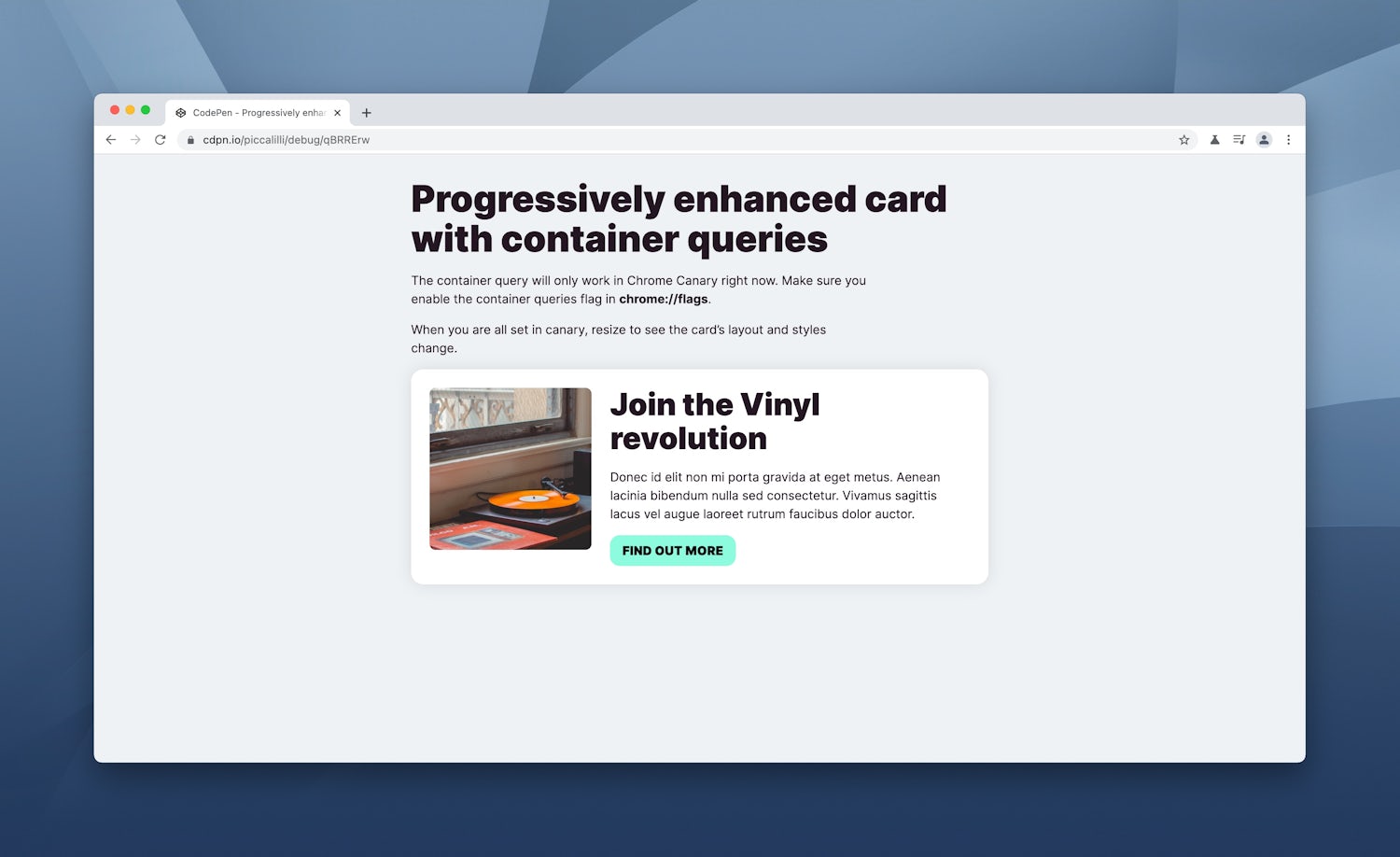
This is handy as it stands, but the context I need container queries for the most is being able to apply these sort of UI changes and they just work regardless of what we stick in them.
See the Pen Progressively enhanced card with container queries - grid only by piccalilli (@piccalilli) on CodePen.
The card now responds to its containers dimensions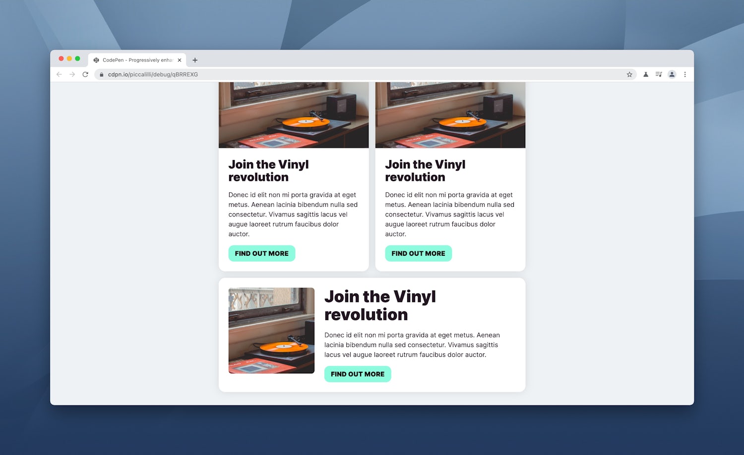
Take the above example. It’s a flexible layout that allows child elements to grow to fill space. No problem with container queries because we set the flex items to be the containers and the rules we set for the cards do the rest. Handy!
Finally, we can typeset in contextpermalink
Most importantly with container queries, we can set typography contextually! This for me is the most needed feature in design system implementations and why I constantly wish we had container queries. We can respond with media queries and set font sizes etc that way, but when you have no idea where an element will end up, this isn’t an ideal approach. Now we have container queries, we can make type adjustments that actually make sense a lot easier than before.
There’s more to come with fluid type too. A lot of fluid type methods—like the one I wrote about—rely on viewport units like vw to scale.
It looks like we’re getting some container units with container queries too, so we will also be able to make fluid type work in context of a container, rather than on the viewport.
- Code language
- css
/* Before */
h1 {
  font-size: clamp(
    var(--fluid-type-min, 1rem),
    calc(1rem + var(--fluid-type-target, 3vw)),
    var(--fluid-type-max, 1.3rem)
  );
}

/* After */
h1 {
  font-size: clamp(
    var(--fluid-type-min, 1rem),
    calc(1rem + var(--fluid-type-target, 5cw)),
    var(--fluid-type-max, 1.3rem)
  );
}
Wrapping uppermalink
Here’s all of the above, condensed into one handy demo. Play around with it and see what you can come up with.
See the Pen Progressively enhanced card with container queries by piccalilli (@piccalilli) on CodePen.
There’s not loads of stuff to cover with container queries yet because the Chrome Canary implementation of them is effectively a prototype. It is great to finally see movement with container queries and actually use them in a browser. I’ll be covering them a lot on this site as they evolve because I’m pretty convinced that container queries will usher a new phase of web design as important as responsive web design.
For now, go and read Miriam’s proposal and explainer. She is really pushing things forwards with CSS, so always be keeping an eye on what she’s up to!
Also, notice that when you looked at the demos in a non-supporting browser, they looked fine? That’s progressive enhancement in action giving everyone a good experience and where support is available, an optimal experience. You should try it; you might like it 😉
Lastly, here’s a fun demo I made when I first got my hands on container queries.
See the Pen My first container query by piccalilli (@piccalilli) on CodePen.
Until next time, take it easy 👋
p.s I guess I can retire this sticker now.