Reality Check #3: Building out a layered hero grid layout from Dribbble
In this edition of Reality Check, I tackle an interesting grid layout that also features some pretty unique background image treatment.
First up, you may have noticed that Reality Check now has a new home. I’ve moved it from Set Studio’s blog to here because I think it makes more sense here, based on the technical nature of the content.
This is also my first post since deciding to bring back Piccalilli. I wanted it to be a good’n so here goes.
This edition’s project permalink
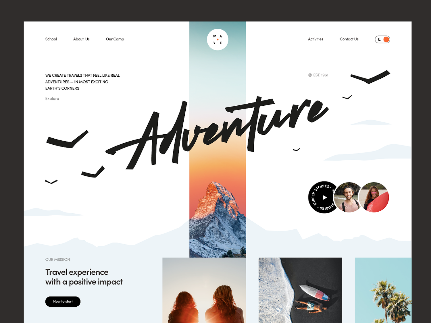
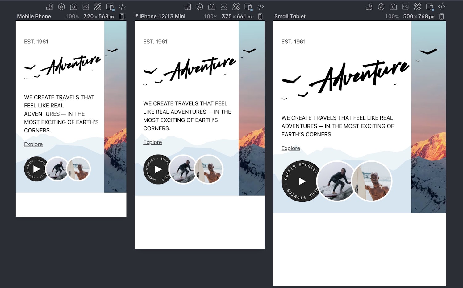
I’ve selected Wave Web Site Design: Landing Page / Home Page UI by Halo UI/UX on Dribbble. The low fidelity hero background image with a photographic stripe through the middle really captured my imagination and it gave me an opportunity to use it — along with other elements on the page — as an opportunity to talk about choosing the path of least resistance. Our focus will be on the hero element only.
Wave Web Site Design: Landing Page / Home Page UI by Halo UI/UX from Dribbble
I’m not actually going to make any design alterations either. Sure, I’m gonna use a Google Font and tweak some of the elements and copy, but there’s been no static comp in Figma this time. We’re instead going to explore how you can treat a static composition as a guide, rather than a source of truth because I know a lot of y’all work with designers who don’t have much technical knowledge and I want to help you out for the future.
Planning and asset creation permalink
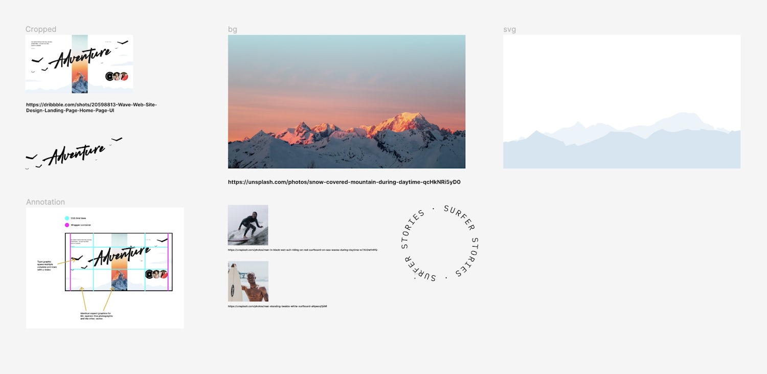
Although I’m not re-working the design, I still wanted to create/treat some assets like the background image(s) and people shots.
It’s also a great opportunity to plan before you build. If I were to give one piece of crucial advice to improve your front-end skills, it’s before you even think about code, grab a cap of what you’re building and draw all over it.
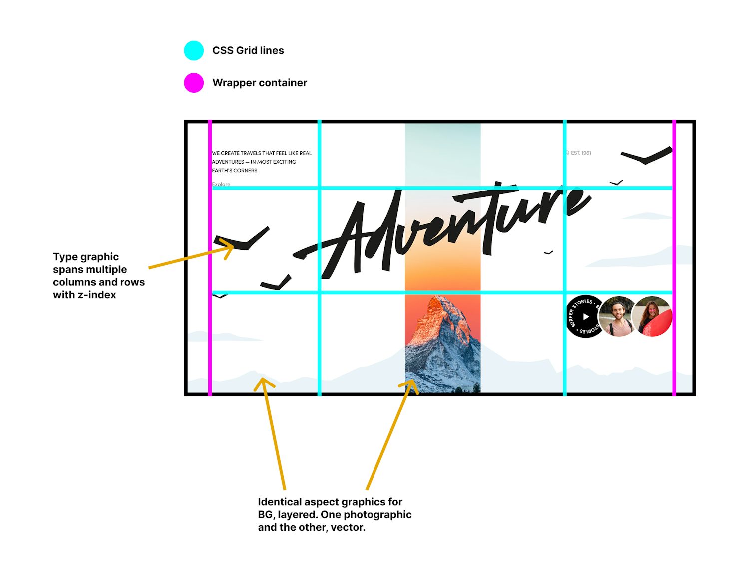
For this project, I knew it was gonna be all about CSS grid, so it was imperative that I sketched out the grid lines. This helped me work out the markup of the page and which elements needed grouping where.
Keeping things simple: background
I’m lucky that I’m a designer by trade so I had the ability to draw out a low-fidelity version of the mountains with the pen tool, knowing I’d mask the photographic version in CSS.
Mountain range image from Unsplash by Marin Tulard
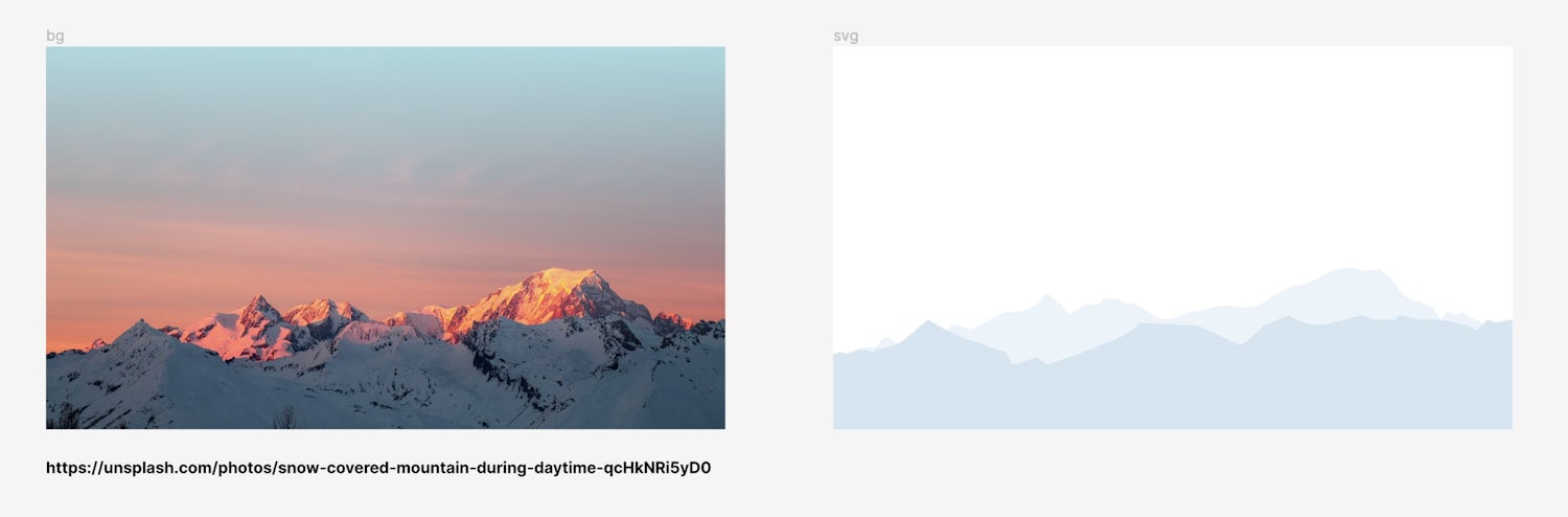
I could have made this one background asset, but as this Dribbble composition has only considered large viewports (as is tradition), that central stripe would cause problems on smaller viewports. More on this later.
The main point to make is getting all this stuff ready in advance allows me to get everything in order, so my focus is purely on semantic markup and CSS when I come to write code.
With all the planning done and assets exported, converted and optimised, it’s time to get stuck in with some code.
HTML first, always permalink
Although the layout is on a pretty interesting grid, the markup actually follows a pretty logical flow.
- Code language
- html
<main>
  <article class="hero">
    <h1 class="visually-hidden">Wave</h1>
    <div class="hero__inner wrapper">
      <p class="hero__meta"><abbr title="Established">Est.</abbr> 1961</p>
      <div class="hero__content">
        <p>
          We create travels that feel like real adventures — in the most exciting of
          Earth’s corners.
        </p>
        <p>
          <a href="#">Explore</a>
        </p>
      </div>
      <img
        src="images/adventure.svg"
        alt="Adventure, in a nice handwritten-like form with illustrated birds surrounding it."
        class="hero__decor-text"
      />
      <a class="hero__action" href="#">
        <span class="visually-hidden">Explore surfer stories</span>
        <figure>
          <div class="negative-grid">
            <div class="roundel" aria-hidden="true">
              <svg xmlns="http://www.w3.org/2000/svg" fill="none" viewBox="0 0 24 24">
                <path fill="currentColor" d="m5 4 15 7.928L5 20V4Z" />
              </svg>
              <img src="images/roundel-text.svg" alt="" />
            </div>
            <img src="images/surfer-1.jpg" class="avatar" alt="" />
            <img src="images/surfer-2.jpg" class="avatar" alt="" />
          </div>
          <figcaption class="visually-hidden">
            Two images of surfers, one surfing on a wave and the other, standing next to
            their board. A roundel sits next to them with round text, repeated, reading
            'surfer stories'.
          </figcaption>
        </figure>
      </a>
    </div>
    <div class="hero__bg">
      <picture class="hero__masked">
        <source srcset="images/bg.avif" type="image/avif" />
        <source srcset="images/bg.webp" type="image/webp" />
        <img
          src="images/bg.jpg"
          loading="eager"
          alt="A mountain range with a sunrise, coming from behind the camera, reflecting off them."
        />
      </picture>
      <img
        src="images/bg.svg"
        loading="eager"
        alt="A low fidelity vector drawing of the mountain range"
        class="hero__mask"
      />
    </div>
  </article>
</main>One thing to note is I’ve added a visually hidden <h1> because there was no heading. There’s headings later in the original composition, but you gotta start with at least a <h1>, so the rest of the page follows a logical hierarchy.
I’ve also used a <picture> element for the photographic background image because I wanted to provide modern image formats in a progressively enhanced manner. The SVG mask is a standard <img> element.
Keeping things simple: circular text
The images of the surfers and the the “Surfer Stories” roundel presented a challenge in itself. It’s tempting in these situations to flex out some CSS/JS techniques — like Michelle Barker’s smart approach to positioning text on a path — but the repeated text provides no value to people that can’t see the roundel itself.

Instead, I opted to treat the images and roundel as presentational(ish) and leverage a <figure> and <figcaption> to describe the content to people that can’t see it. I also added a more appropriate, visually hidden label to make the link make more sense.
The text was achieved with the following Figma plugin. I love how simple and inclusive this plugin is. Positioning text on a path is super fiddly in tools like Adobe Illustrator, so a plugin like this in Figma opens this technique up to more people.
The overall point I’m trying to make here though is keeping things simple where loads of effort would be wasted — for a largely presentational element — frees up your energy to focus on what’s really important: making a website that works for everyone.
Global CSS permalink
Ooof, I’ve just checked the word count and I’ve gone over a thousand words before I’ve even got near the CSS. There’s lots of important things to get right before you style things up and the CSS is actually quite straightforward from here on in, so consider this as laying the foundation properly, to get things right for everyone.
Before the global CSS gets added, I pulled in this CSS reset to get some sensible defaults going. As always, I’m using the CUBE CSS methodology.
Global CSS-wise, it’s pretty slim
- Code language
- css
:root {
  --font-base: 'DM Sans', -apple-system, BlinkMacSystemFont, avenir next, avenir, segoe ui,
    helvetica neue, helvetica, Cantarell, Ubuntu, roboto, noto, arial, sans-serif;
  --color-dark: #252525;
  --color-light: #ffffff;
  --color-mid: #555555;
  --gutter: 1.5rem;
}

body {
  background: var(--color-light);
  color: var(--color-dark);
  font-family: var(--font-base);
  margin: 0;
}

a:not([class]) {
  color: var(--color-mid);
}

a:not([class]):hover {
  text-decoration: none;
}

abbr {
  text-decoration: none;
  cursor: help;
}

figure {
  margin: 0;
}

:focus {
  outline: 2px solid currentColor;
  outline-offset: 0.25lh;
}
It’s light because we’re only focusing on the hero layout. Were we to be building the whole site, there’d be a lot more to add, but in the interests of keeping this article as slim as possible, we’ll focus only on what appears on the page we have.
Everything is pretty self-explanatory, but the part I want to shed light on is the <abbr> styling. I used that for the Est. 1961 section so I could expand “Est.” as “Established”. I like to add a help cursor to these elements too. Also, check out the outline-offset. Using the new(ish) lh unit is pretty handy to set that.
Lastly, always underline your links. I opted not to remove the link underlines as the original composition suggested.
Utilities permalink
Traditionally, I tackle the C in CUBE CSS first: compositions, but today, it’s utilities. Let’s start with the visually-hidden utility.
- Code language
- css
.visually-hidden {
  border: 0;
  clip: rect(0 0 0 0);
  height: auto;
  margin: 0;
  overflow: hidden;
  padding: 0;
  position: absolute;
  width: 1px;
  white-space: nowrap;
}
Using this quick tip, elements that have this class visually disappear but are still accessible to screen readers etc.
Let’s see at how the page currently looks:
Compositions permalink
We’ve got two layouts to tackle. First, there’s a negative grid which stacks items on top of each other.
Negative grid
- Code language
- css
.negative-grid {
  display: grid;
  grid-template-columns: repeat(auto-fit, clamp(5rem, 33%, 10rem));
  transform: scale(83.333%);
  transform-origin: left;
}

.negative-grid > * {
  transform: scale(120%);
  transform-origin: left;
}
You might have thought some negative margin would power this, but there’s a simpler way: using the power of transform.
The trick is to upscale each item — 120%/1.2 in our case — then downscale the parent to 83.333%. You calculate this by dividing 1 by the upscaled ratio (1.2). This means everything is the same size, but the items now stack naturally. Make sure you set a transform-origin though to make it as predictable as possible.
One thing to highlight here is none of the visual styles for the surfer photos or the roundel are being covered in this layout. Compositions are skeletal layouts that focus only on positioning their children.
Wrapper
This one is really straightforward:
- Code language
- css
.wrapper {
  margin-inline: auto;
  max-width: 1600px;
  padding-inline: var(--gutter);
}
It pushes content into the middle of the viewport. You could use relative units for the max width, or get more creative about the sizing like this article, but in this context, we’re keeping it simple.
The page is not looking great yet, but it’s worth us checking in to see how things are looking still:
Blocks permalink
Let’s get stuck into the good stuff now: making stuff look sweet!
Hero
Before we tackle the layout of the hero, I just want to remind you of the planning I did before:
The wrapper (magenta lines) is already accounted for and is already present in our hero markup. All we need to focus on now is:
- The grid layout
- Layering the backgrounds
- Masking the background photo
The other point of focus is what the hell do we do on small viewports? I think slightly modifying the display order (tread carefully with this) and creating a right-hand gutter that reveals the mountains photo is a pretty sensible approach.
Let’s tackle that first, building mobile-up.
- Code language
- css
.hero {
  position: relative;
  padding-block: 2rem;
  text-transform: uppercase;
}

.hero p {
  max-width: 40ch;
}

.hero a {
  text-transform: none;
}
I’m letting inheritance do its job with text-transform because most of the content is uppercase. I then revert that for the links (I’d personally keep it all consistent).
Setting a max-width on the paragraphs is to account for those weird viewport sizes that are not quite narrow. The grid takes care of them in most cases though.
The outer hero block is a relative parent and the grid is on hero__inner, so let’s do the smaller viewport version first.
- Code language
- css
.hero__inner {
  display: grid;
  grid-template-columns: 80% 20%;
  grid-template-rows: 1fr auto auto;
  gap: var(--gutter) 0;
  position: relative;
  z-index: 1;
}

.hero__inner > * {
  grid-column: 1;
}
This is still a three row grid, but now I’m setting two columns, split as 80/20. You could make the 20% column a fixed width if you wanted then 1fr on the first column to fill the space.
The reason I’ve added z-index is because:
- I want to create a stacking context to better control the illustrative text later
- I want the grid to sit above the soon to be absolutely positioned background elements
All the direct children of the grid are added to the first column here too because as it stands, the second column is a gutter.
Let’s map out the rows and other details.
- Code language
- css
.hero__meta {
  grid-row: 1;
  color: var(--color-mid);
}

.hero__decor-text {
  grid-row: 1;
  grid-column: 1/3;
  margin-top: 3rem;
  z-index: -1;
}

.hero__content {
  grid-row: 2;
}

.hero__action {
  grid-row: 3;
}
The main thing to touch on here is the hero__decor-text element. Everything is in the first column, but I wanted this to “bleed out” into the gutter. The reason it’s grid-column: 1/3 and not grid-column: 1/2 is because if you want an item to span over multiple columns, you need to set the end to be the next column’s grid line. Column three doesn’t exist, but its grid line does.
The negative z-index is to put the decorative text behind proper content. We can do this because we’re in a new stacking context, thanks to our .hero__inner grid layout.
That’s the small viewport layout done, so let’s get the small viewport background done.
- Code language
- css
.hero__bg {
  position: absolute;
  inset: 0;
  z-index: 0;
}

.hero__bg :is(img, picture) {
  width: 100%;
  height: 100%;
  object-fit: cover;
  position: absolute;
  inset: 0;
}

.hero__bg picture {
  z-index: 1;
  clip-path: inset(0 0 0 80%);
}
The .hero__bg element is a wrapping container for both backgrounds. Because .hero is a relative parent, we can safely set the background to be absolutely positioned and fill the whole parent with inset: 0. Setting z-index: 0 sits the images behind the content.
Next up, we need all the images to fill the .hero__bg, so again, we can use absolute positioning. Setting object-fit: cover prevents them from squishing and crops them out for us, accordingly.
Lastly, the mask that hides most of the photographic mountains. We know we have 20% of the layout as gutter, so the clip-path can take up 80% of the image. Job done!
Let’s now expand the layout for larger viewports.
- Code language
- css
@media (min-width: 985px) {
  .hero__inner {
    padding-block: 4rem;
    gap: 0 var(--gutter);
    grid-template-columns: 1fr 2fr 1fr;
    grid-template-rows: 1fr 2fr 1fr;
  }

  .hero__meta {
    grid-column: 3;
    grid-row: 1;
  }

  .hero__content {
    grid-column: 1;
    grid-row: 1;
  }

  .hero__decor-text {
    grid-column: 1/4;
    grid-row: 4/1;
  }

  .hero__action {
    grid-column: 3;
    grid-row: 3;
  }

  .hero__bg picture {
    clip-path: inset(0 40% 0 40%);
  }
}
I can hear some of you thinking “Andy, using media queries for layout?!?!”. Sometimes you just gotta do it — especially for very specific layouts like this one.
There’s a balance with these things. Sure, I could spend hours working out an Every Layout-like layout, but I think this setup is also pretty flexible. If I were having to roll out multiple breakpoints, I’d start to re-work the visual design, but I don’t need to here.
I guess the message is even I use media queries and specific layouts sometimes, so if you’re dialled in on being the browser’s mentor, not it’s micromanager: be easy on yourself and choose the path of least resistance where you need to.
In terms of our above code, it’s pretty self explanatory based on what we’ve already covered earlier in the article. All we’re doing is expanding and spanning multiple columns/rows and placing items in specific places. Because it was planned out before the build, it was quick and easy with grid.
Avatar
This is pretty cut and dry CSS:
- Code language
- css
.avatar {
  border-radius: 100%;
  border: 0.25em solid var(--color-light);
  aspect-ratio: 1/1;
  object-fit: cover;
}
We’re making them round with a square aspect ratio. The object-fit property is making sure images don’t get squished. It’s more defensive CSS than anything else because even though our images are square, they might not be in the longer term (were this a real project), so this little rule future proofs things a bit.
Roundel permalink
Right, we’re on the last part. Sorry, this has been a real deep dive 😅
Let’s first get everything looking nice.
- Code language
- css
.roundel {
  position: relative;
  aspect-ratio: 1/1;
  background: var(--color-dark);
  color: var(--color-light);
  padding: 0.5em;
  border-radius: 100%;
}

.roundel img {
  width: 100%;
  height: 100%;
  transform-origin: center;
  animation: roundel-rotate 5s linear 0s infinite;
  animation-play-state: paused;
}

.roundel svg {
  width: 2rem;
  height: 2rem;
  position: absolute;
  top: 50%;
  left: 50%;
  transform: translate(-50%, -50%);
}
The .roundel itself is the black circular element which is also a relative parent. Just like the .avatar, we’re using aspect-ratio to make it a square, before using border-radius to make that a circle.
Now that we have a relative parent, we can again, use absolute positioning to position it’s children. Just like the .hero images, it’s a pretty safe context for that — mainly because in our .roundel context, it’s all pretty predictable.
Because I opted to artwork the circular text, it’s a case of letting .roundel img fill the parent. There’s an animation to rotate it too, but by default, that state is paused.
The .roundel svg is the little arrow icon. Using a combo of positioning and transform, we stick that right in the middle of the .roundel.
- Code language
- css
@keyframes roundel-rotate {
  from {
    transform: rotate(0deg);
  }
  to {
    transform: rotate(360deg);
  }
}

:hover > .roundel img {
  animation-play-state: running;
}
The animation is quite simple because we know it needs to rotate from 0deg to 360deg. CSS animation syntax gives us a handy from and to to make that quite easy to understand.
The :hover selector waits for the .roundel’s parent to be hovered, rather than the element itself. This means that if any of its siblings are hovered, it’ll trigger the animation.
Wrapping up permalink
That’s it, we are done! Let’s check in how it looks.
I feel like this one has been considerably simpler than the other two editions, but it has been a great opportunity for me to show you the pre-coding stuff and also — most importantly — the value and trade-offs of simplifying a build as much as you can.