Use CSS Clamp to create a more flexible wrapper utility
A handy way to use modern CSS functions to give yourself fine-grained, yet flexible, design control.
You can use clamp() to set three values: a minimum, an ideal and a maximum.
This is really handy in the context of a wrapper, because it’s a mostly fluid element, often limited with a max-width. This becomes a slight issue in mid-sized viewports, such as tablets in portrait mode, in long-form content, such as this article because contextually, the line-lengths feel very long.
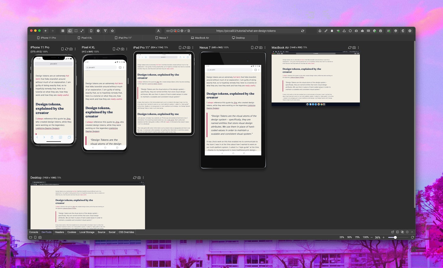
Even though the line lengths are set to a sensible width in CSS, contextually, they still look very long in medium viewports.
If we use clamp() to use a viewport unit as the ideal and use what we would previously use as the max-width as the clamp’s maximum value, we get a much more flexible setup.
- Code language
- css
/**
 * WRAPPER
 * Sets a max width, adds a consistent gutter and horizontally
 * centers the contents
 */
.wrapper {
  width: 90vw;
  width: clamp(16rem, 90vw, 70rem);
  margin-left: auto;
  margin-right: auto;
  padding-left: 1.5rem;
  padding-right: 1.5rem;
  position: relative;
}Here’s how it looks after setting our new wrapper:
This is much better now and the content looks like it has much more breathing room, making it easier to read.

This is a very small tweak, but these design details are what makes the user-experience that little bit better. Check out this handy write-up by Una Kravets.