Let’s make a floating button sign up form pattern
I tackle an age-old design pattern and build it with nice, simple CSS.
Sign up forms, they’re pretty common! What’s also common is for the submit button to float above the input, like this:
There’s a problem though. A lot of the time, the input is behind the button, which in itself is too much of a risk for stuff going wrong. Worst, in some cases, the content of the input can also end up behind the button. These alone are not good for users, nor is using a placeholder as a label.
We’re not doing any of that today though and I’m going to show you how I’d go about this sort of pattern. Let’s get cracking.
HTML first, always permalink
You gotta get the foundations right before making things look good. This thing needs to work when there is no CSS available, so let’s get some semantic markup in place:
- Code language
- html
<form class="sign-up-form flow">
  <label for="email">Enter your email to sign up for our newsletter</label>
  <div class="sign-up-form__controls sidebar">
    <input type="email" name="email" id="email" autocapitalize="none" autocorrect="off" pattern="[^@]+@[^\.]+\..+" required placeholder="[email protected]" />
    <button class="button">Subscribe</button>
  </div>
</form>
Using a placeholder as a label is problematic both in that it will not be announced correctly with assistive technology and the default browser style has contrast issue. Oh, it disappears when you start typing too… Eric has a good guide for you here.
Instead, I’ve opted for the opening line of text being the label because it’s describing what to do. This decision very much relies on that fact though, so use cautiously!
Another bit to pick up on is that removing auto-capitalisation and autocorrect is a very good thing to do. Emails are almost always lowercase and people don’t want their email addresses being autocorrected by an over-eager operating system like iOS. The placeholder is being used correctly in this case, demonstrating an example of the data we require from the user.
The pattern attribute has been added as a slightly more robust value than the default HTML email validator that just looks for an @ in the string. It’s not overly helpful by default and prone to risk. Still, validate stuff that is posted to the server, always!
Global CSS permalink
We can tackle a fair bit of styling high up, so let’s get that in place first.
- Code language
- css
:root {
  --color-dark: #101724;
  --color-primary: #415a77;
  --color-light: #f3f0e7;
  --color-light-shade: #ede9dc;
  --gutter: 2em;
  --radius: 0.25em;
  --font-base: -apple-system, BlinkMacSystemFont, avenir next, avenir, segoe ui,
    helvetica neue, helvetica, Cantarell, Ubuntu, roboto, noto, arial,
    sans-serif;
}

body {
  background: var(--color-dark);
  color: var(--color-light);
  font-family: var(--font-base);
  margin: 0;
  padding: var(--gutter);
}

input {
  padding: 0.75em;
}

::placeholder {
  opacity: 1;
  color: var(--color-dark);
}

:focus {
  outline: 1px solid currentColor;
  outline-offset: -0.25lh;
}
There’s not a huge amount to add to this other than I’m setting opacity: 1 for the ::placeholder styles to account for older versions of WebKit browsers like Safari, who reduce the opacity of placeholders for some bizarre reason.
I’m also tackling :focus styles globally. You might not want to apply a negative outline-offset globally though and instead, opt to set that at a component level.
See the Pen Demo with global only styles by piccalilli (@piccalilli) on CodePen.
Adding a compositional layout permalink
We’re going use the Sidebar from Every Layout, to sit the input and button next to each other where there is space, but wrap nicely where there isn’t.
- Code language
- css
.sidebar {
  display: flex;
  flex-wrap: wrap;
  gap: var(--gutter);
}

.sidebar > :last-child {
  flex-basis: var(--sidebar-target-width, 20rem);
  flex-grow: 1;
}

.sidebar > :first-child {
  flex-basis: 0;
  flex-grow: 999;
  min-width: var(--sidebar-content-min-width, 50%);
}
What’s really important to note here is that I’ve flipped the original Sidebar layout by treating the :last-child as the sidebar and the :first-child as the expanding content area. We’ll tweak the configurable Custom Properties in a moment.
Sitting with the sidebar is my favourite 3 lines of CSS:
- Code language
- css
.flow > * + * {
  margin-top: var(--flow-space, 1em);
}
I’ll let this write-up explain that to you to keep things snappy here.
That’s compositions done and things are shaping up quite nicely.
See the Pen Demo with global only styles and compositional layouts by piccalilli (@piccalilli) on CodePen.
Blocks permalink
The infrastructure is in place, so let’s start making it all look good. First of all, let’s style up the button.
- Code language
- css
.button {
  background: var(--color-primary);
  color: var(--color-light);
  border: 1px solid var(--color-primary);
  border-radius: var(--radius);
  padding: 0.5em 1em;
  font-weight: 700;
  text-transform: uppercase;
  cursor: pointer;
}

.button:hover {
  background: var(--color-dark);
}

.button:active {
  transform: scale(99%);
}
Most of this is pretty self-explanatory, but let me alert you to the border. It’s the same colour as the background, but it’s important not to set border: none. This is because of users who prefer high contrast. Backgrounds are often not rendered in this environment, so we need to provide a border. You can do that with a transparent border too, like Dave writes.
Our pattern in a Windows High Contrast context
I’ll also address my use of cursor: pointer. Some will argue that a button shouldn’t use a pointer cursor, but I argue it’s such a common pattern — just like button links — that it makes sense for your UI to feel as familiar as possible.
With the button in place, things are really starting to shape up, visually.
See the Pen Demo with button styles added by piccalilli (@piccalilli) on CodePen.
Moving on to the sign-up-form block now which does a lot of work for us. Let’s focus first on what it styles high up:
- Code language
- css
.sign-up-form {
  --sidebar-target-width: max-content;
  --sidebar-content-min-width: 13rem;
  --sign-up-form-space: 0.5em;
  --gutter: var(--sign-up-form-space);

  max-width: 60rem;
  margin-inline: auto;
  text-align: center;
  font-size: 1.2em;
}
Let’s break down each Custom Property configuration first.
The --sidebar-target-width configures our sidebar layout. It allows the sidebar to effectively wrap content where there is not enough space to expand. Setting the value as max-content will stop the button from growing and instead, use its content to size itself.
By setting --sidebar-content-min-width to 13rem means the sidebar should be at least 13rem (approx. 200px) before it even thinks about expanding to an inline layout.
We’re setting --sign-up-form-space variable both to keep spacing inside the component consistent, but also to calculate radius later.
Lastly, by setting --gutter to --sign-up-form-space, the sidebar layout will get that consistent spacing too. It’ll be invisible most of the time, but having space between the two interactive elements is a good idea for high contrast contexts.
- Code language
- css
.sign-up-form__controls {
  background: var(--color-light-shade);
  padding: var(--sign-up-form-space);
  border-radius: calc(var(--radius) + var(--sign-up-form-space));
}
Ok, this is the start of making that floating-like UI. We have an element that wraps both the button and input and it is made to look input-like. We’re also using this trick I wrote about to get a nice consistent inner and outer radius.
- Code language
- css
.sign-up-form input {
  background: transparent;
  border: 1px solid transparent;
  border-radius: var(--radius);
}

.sign-up-form input:focus {
  outline-offset: 0;
}
We’re setting the background to transparent to “hide” the input here but just like with the button, we’re applying a border — in this case transparent — so its visible in high contrast contexts.
The border radius applies because there will be a focus ring, so it’s nice for that to have the consistent radius visual. Setting the outline-offset to 0 assists with that nice touch too.
- Code language
- css
.sign-up-form label {
  display: block;
  max-width: 50ch;
  margin-inline: auto;
  text-wrap: balance;
}
Last up, by setting a max-width and pushing the label into the center, along with some balanced text wrapping, allows for a nice controlled and easy to read label at all viewports. The text will already be centered because the label inherits that from the .sign-up-form block’s root styles.
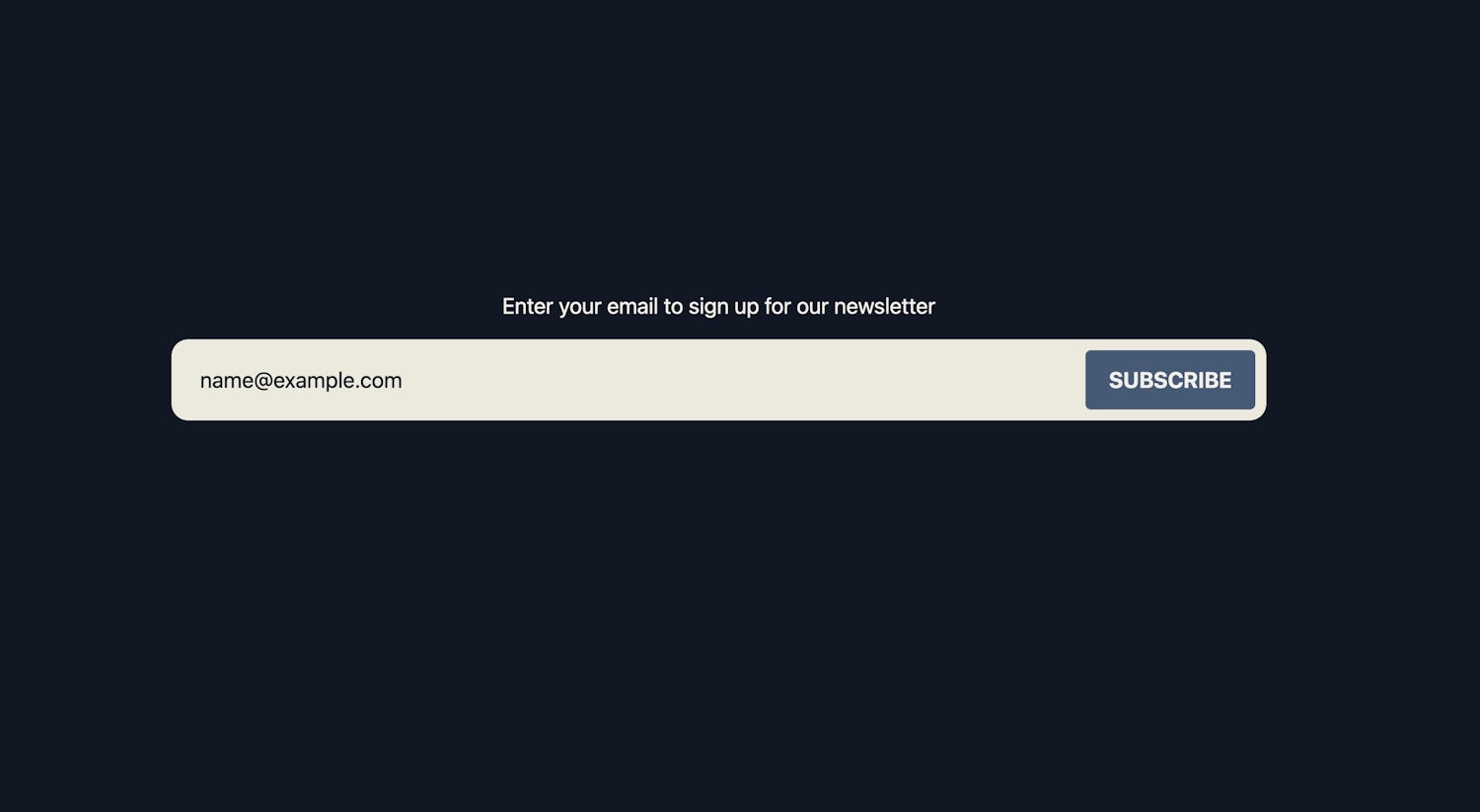
Here’s what it looks like when it’s all complete:
See the Pen Our completed demo! by piccalilli (@piccalilli) on CodePen.
Pretty cool right?
Wrapping up permalink
How could you improve this pattern? First of all, get some client-side validation with some nice message styles in place. Also, if this is being posted with JavaScript (please make sure it works without too), then I’d recommend implementing some status styles too like a loading, error and success state.
I’ve skipped those to keep this article nice and snappy though. I’ve also covered that stuff in a previous Front-End Challenges Club solution, which even half a decade later, still works pretty damn well well 😎